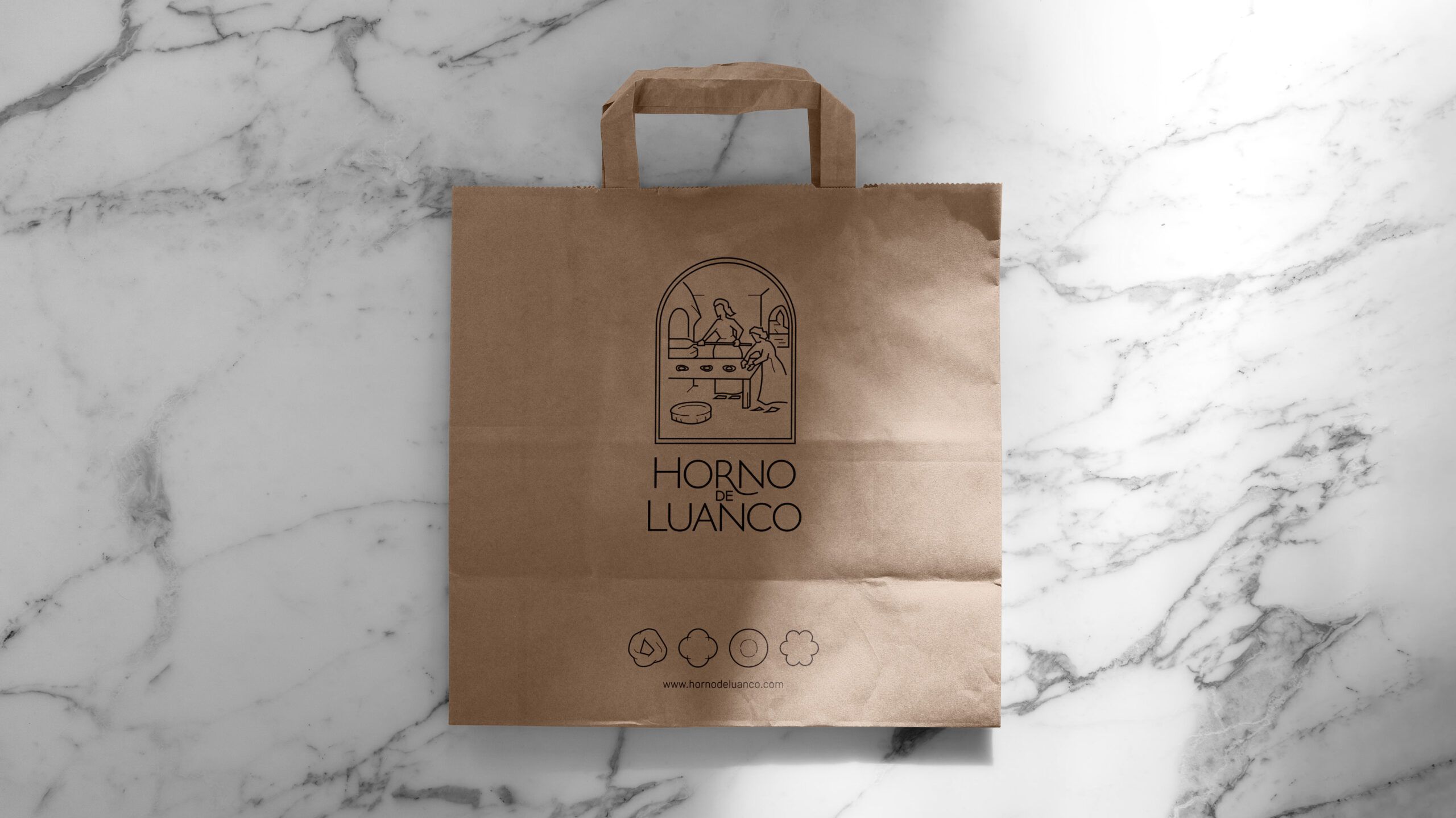
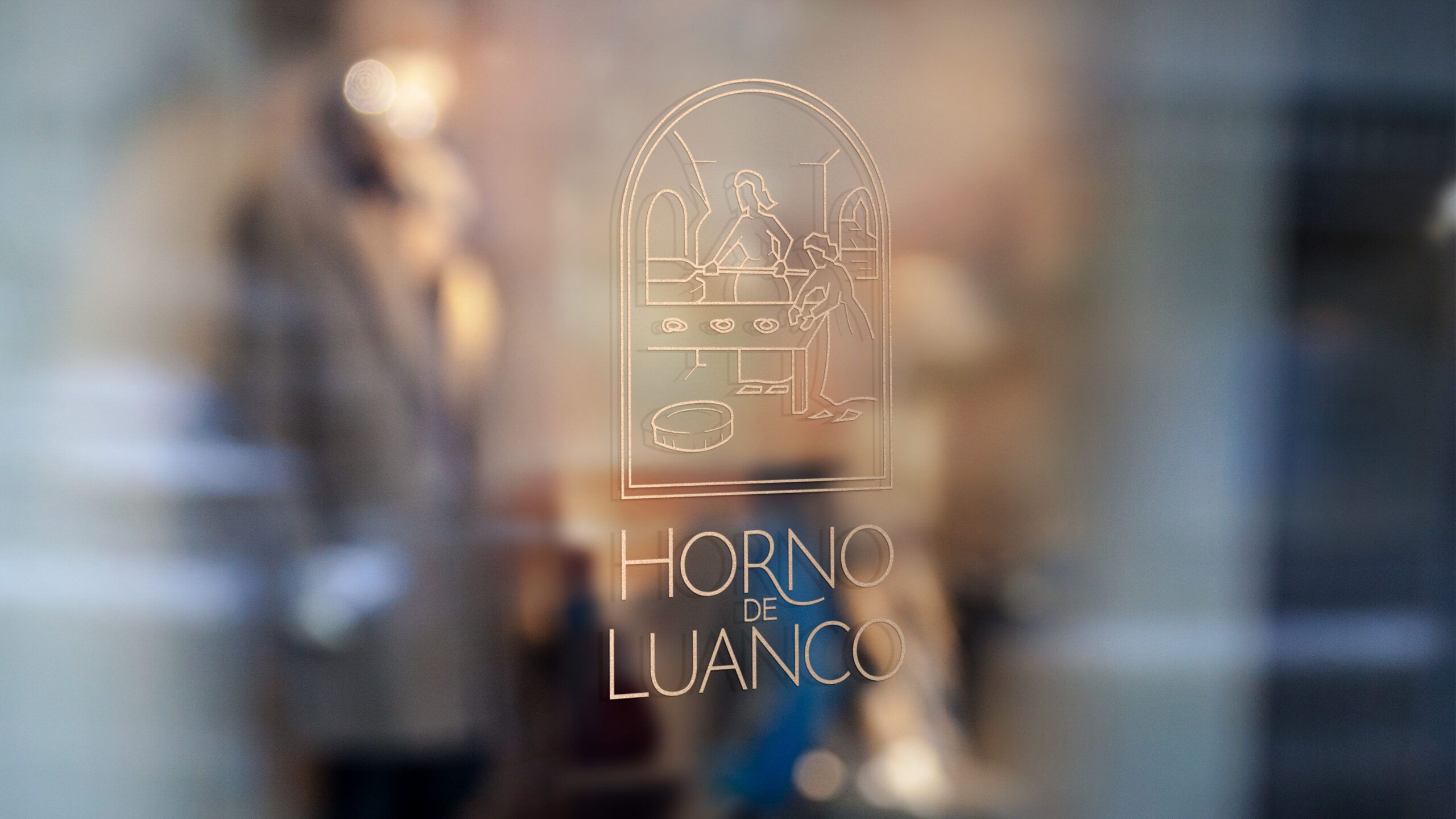



Luanco Oven is the place where the production and baking of Marañuelas is still done in the same traditional way as tradition dictates.
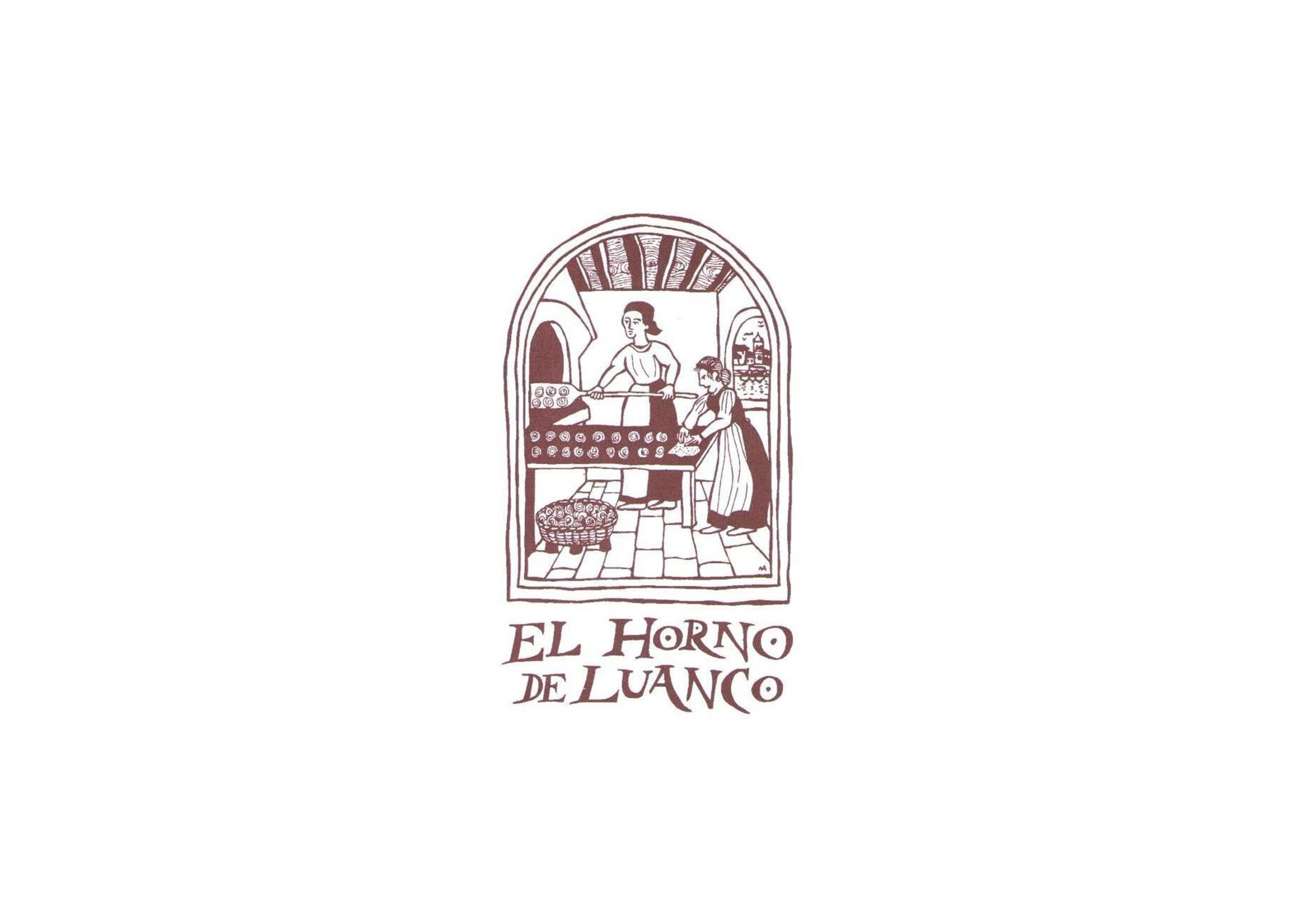
Luanco Oven had an image that identified it based on an illustration by a local author which, despite being very descriptive of the craft, contained a large number of elements and a classic engraving style that made it difficult to read. The mark was also completed with a manual typography that was difficult to understand and difficult to reproduce by electronic media. A study of the brand, the competition and, generally speaking, the sector revealed the need to update its image in order to maintain the company’s standards of quality and competitiveness.
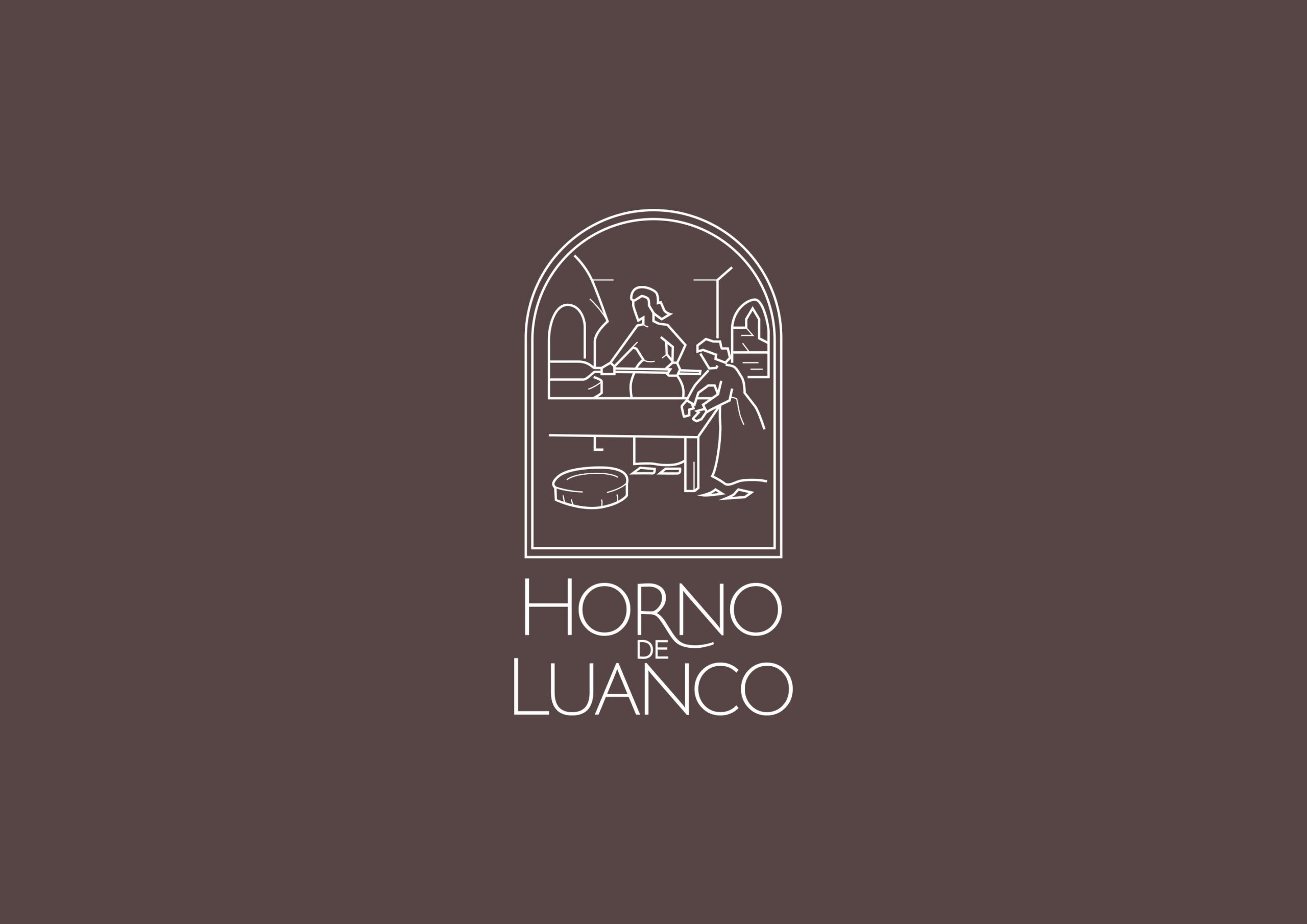
For the redesign of the brand, a much more simplified iconic scale has been used, eliminating unnecessary elements and modernising the illustration with simpler and more defined lines. As for the typography, the text has been hierarchised, highlighting the words Oven and Luanco and changing to a more legible and modern typeface, while maintaining a nod to tradition in the link between r and n.
BEFORE
AFTER
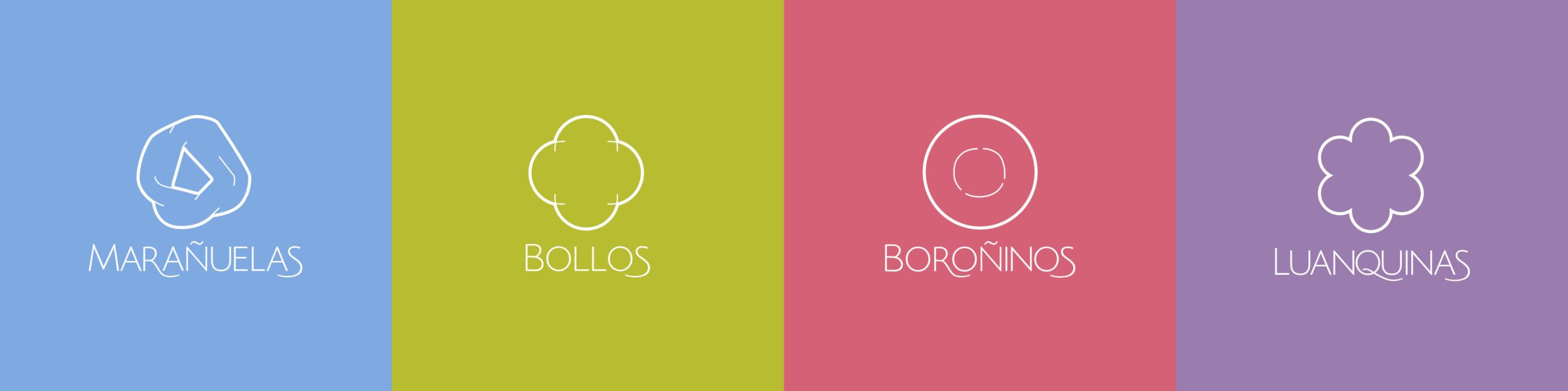
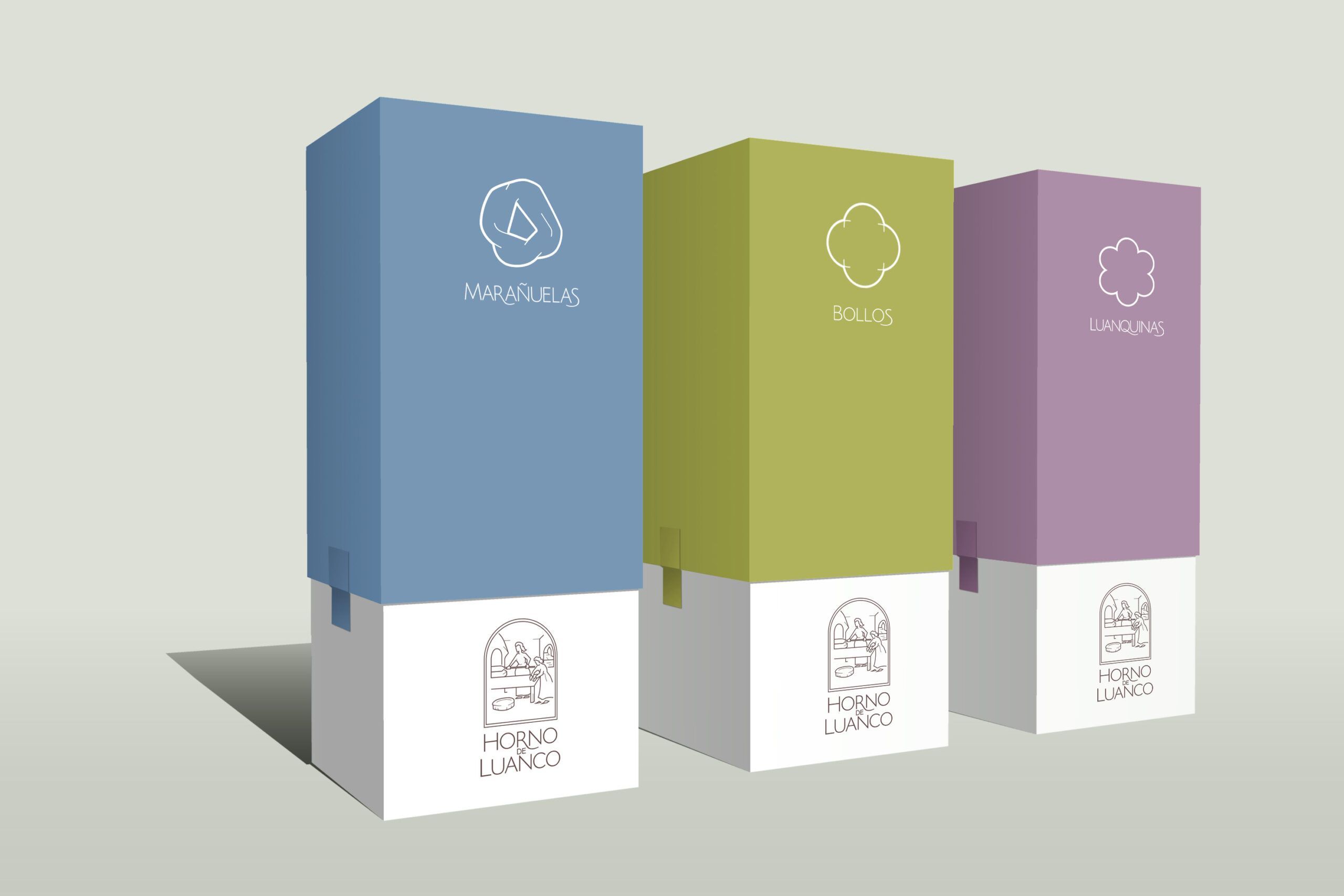
Following the iconic scale created for the redesign of the brand’s logo, 4 sub-brands were created to illustrate Luanco Oven’s products.
Based on the corporate typography and a linear simplification of the shape of each product, to which a colour of their own is then added, the 4 brands are configured.