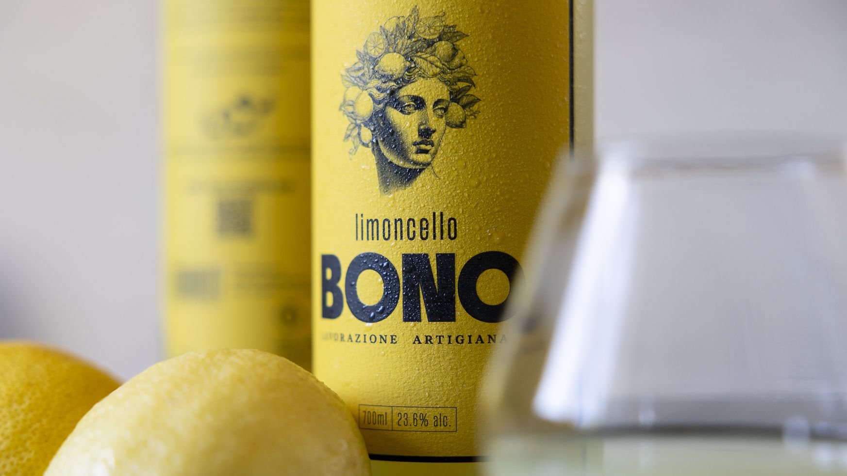




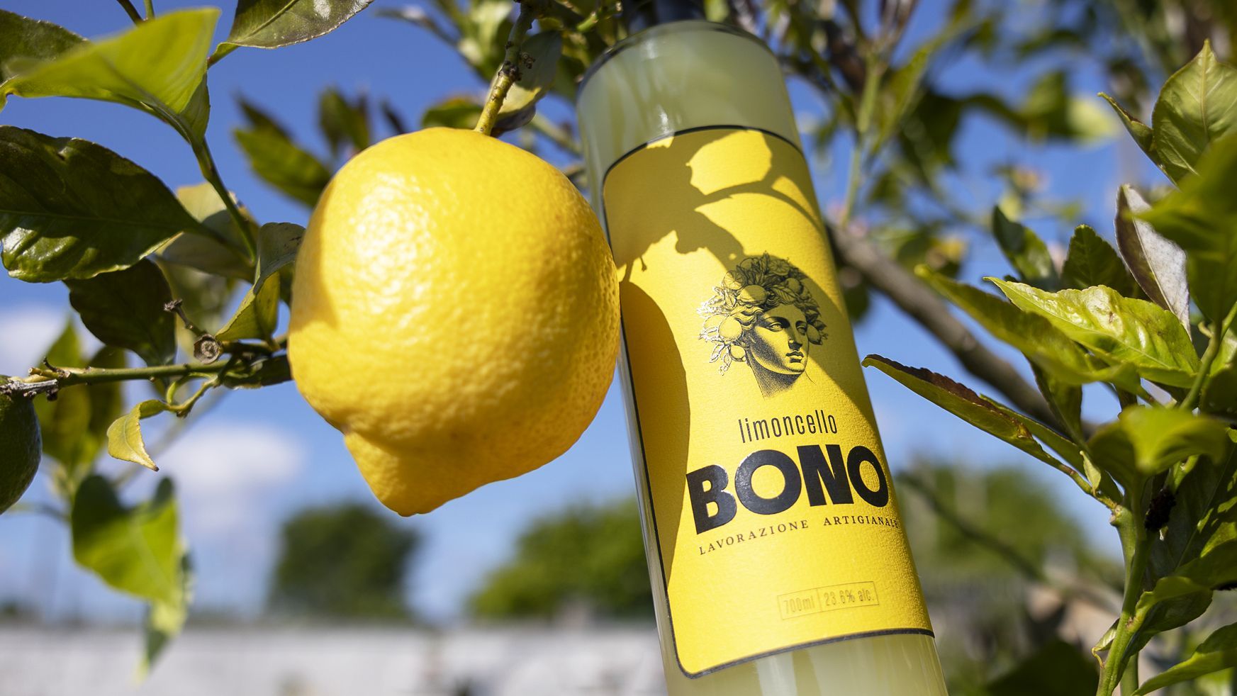
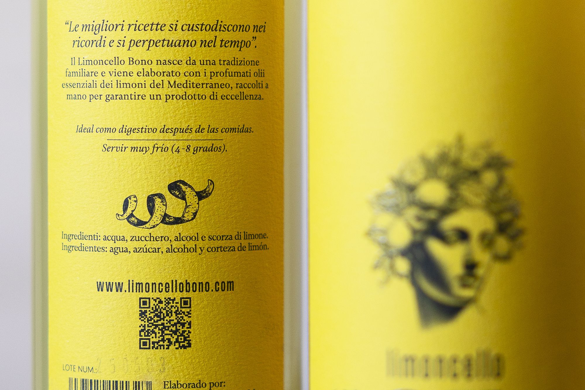
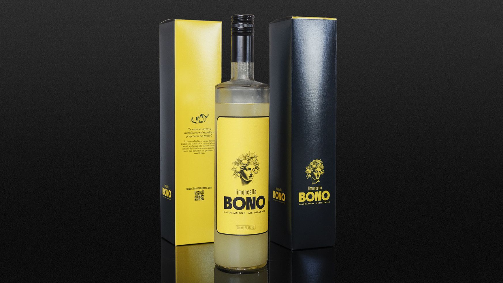
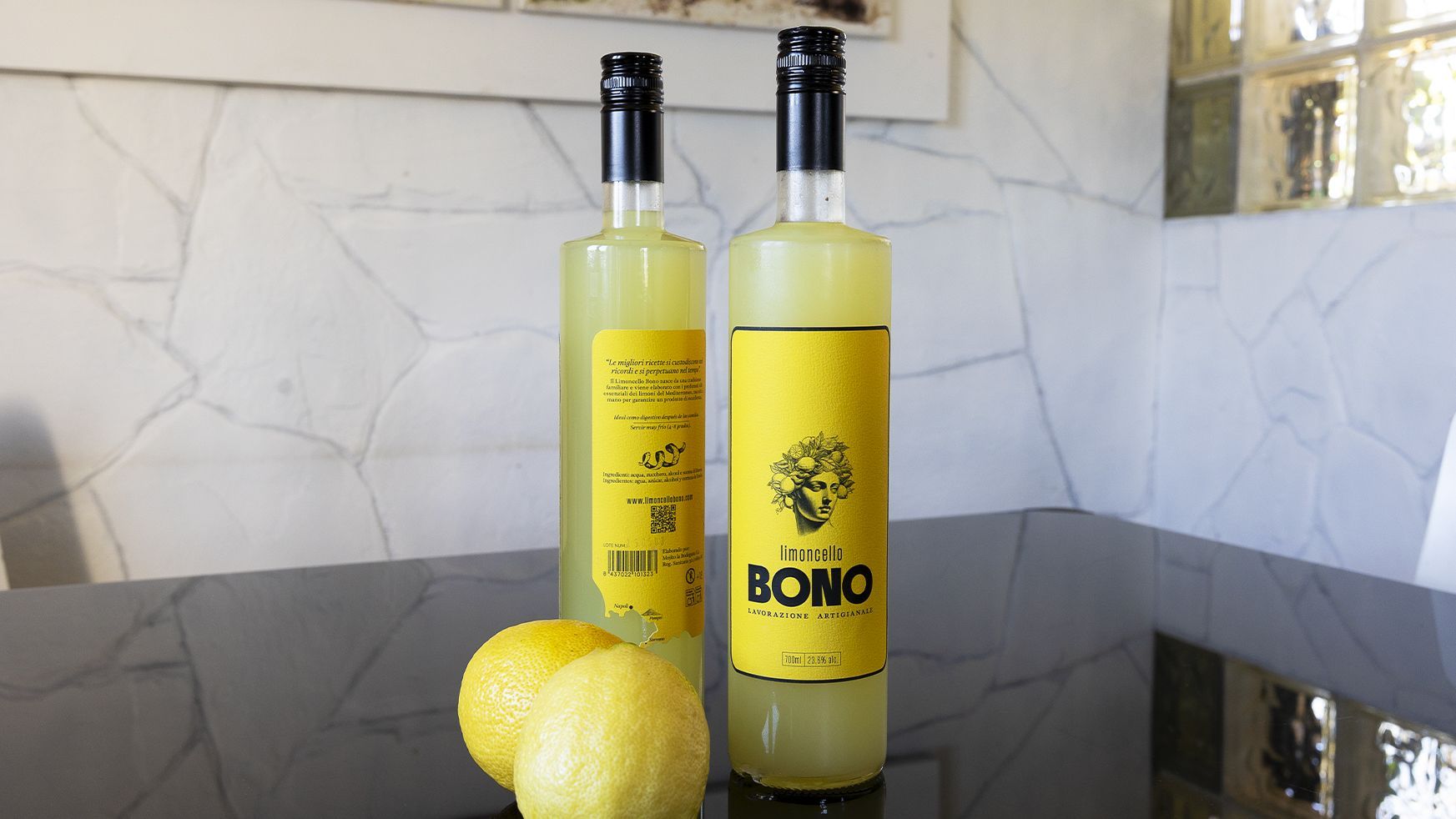



Limoncello Bono is about memories, care, and quality ingredients. Our challenge was to translate all of that into a design that needed no explanation, only to be touched, seen, and ultimately enjoyed. It is a project born from a family tradition and materialized in a brand and packaging that seek to capture that intimate origin without sacrificing a contemporary and careful execution.
The bottle, with its clean lines and balanced proportions, allows the natural color of the product to take center stage, while the labeling introduces texture and visual contrast to improve the experience immediately.
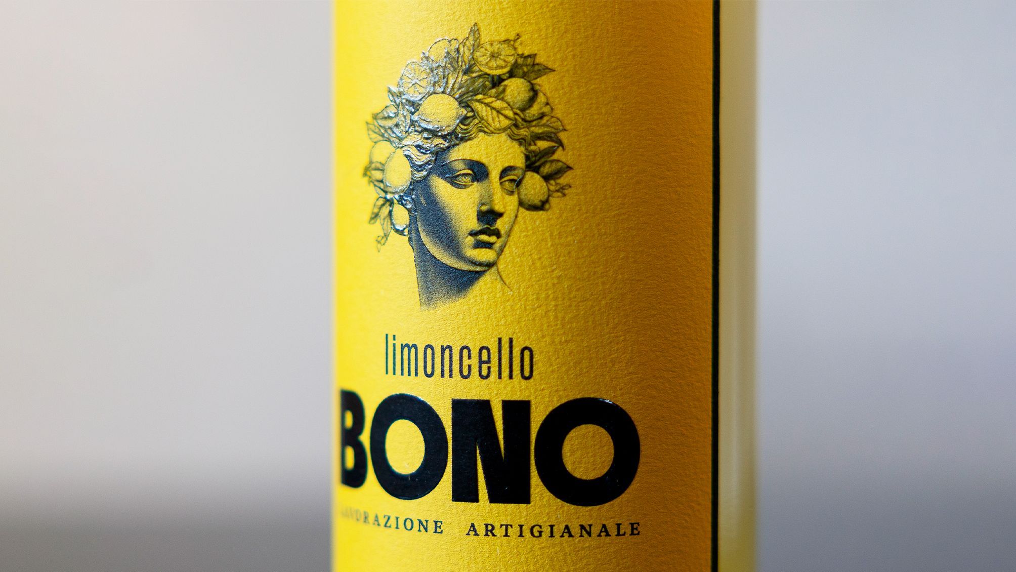
The paper chosen for the label has a rough finish that directly references the skin of a lemon, establishing an immediate link between the container and its contents. This tactile feature is complemented by the use of localized UV varnish, which adds shine and relief to certain graphic elements, guiding the eye and adding sophistication without artifice.
The design is completed with a hard case that protects and elevates the product. Its surface subtly reproduces the texture of the label, enhancing the visual coherence of the overall design. It has been conceived as a container for gifting, storing, or simply keeping, with a clean design that does not rival the bottle but discreetly accompanies it.
The entire system is based on the graphic identity we developed, opting for a sober, artisanal, and timeless style. The logo, typography, illustration, and composition work in an integrated way with the packaging, understanding that the container is not only a functional support but also the first point of contact with the story behind the product.
The illustration use transcends the brand and serves to add details to labeling, packaging, or communication on the web or social media.