


The Corredoria pharmacy offers a constant improvement in pharmaceutical care thanks to its wide range of services: dermocosmetics, magistral formulas, specialists in skin and mucous membranes of oncology patients, nutrition and dietetics…
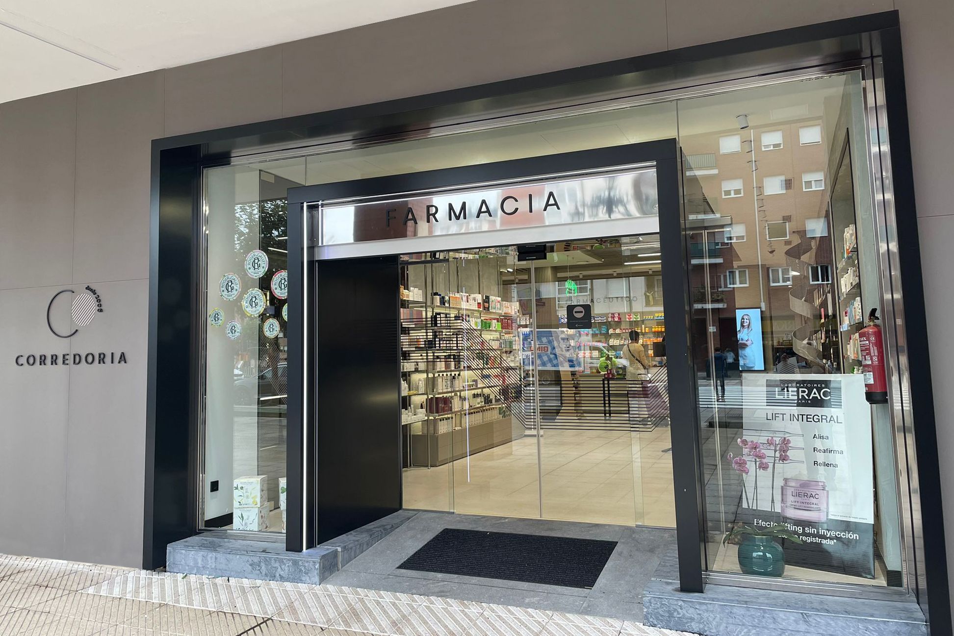
Its new image is modern, minimalist and versatile, perfectly representing the variety of sections offered to the customer.
The Corredoria brand is established on three levels:
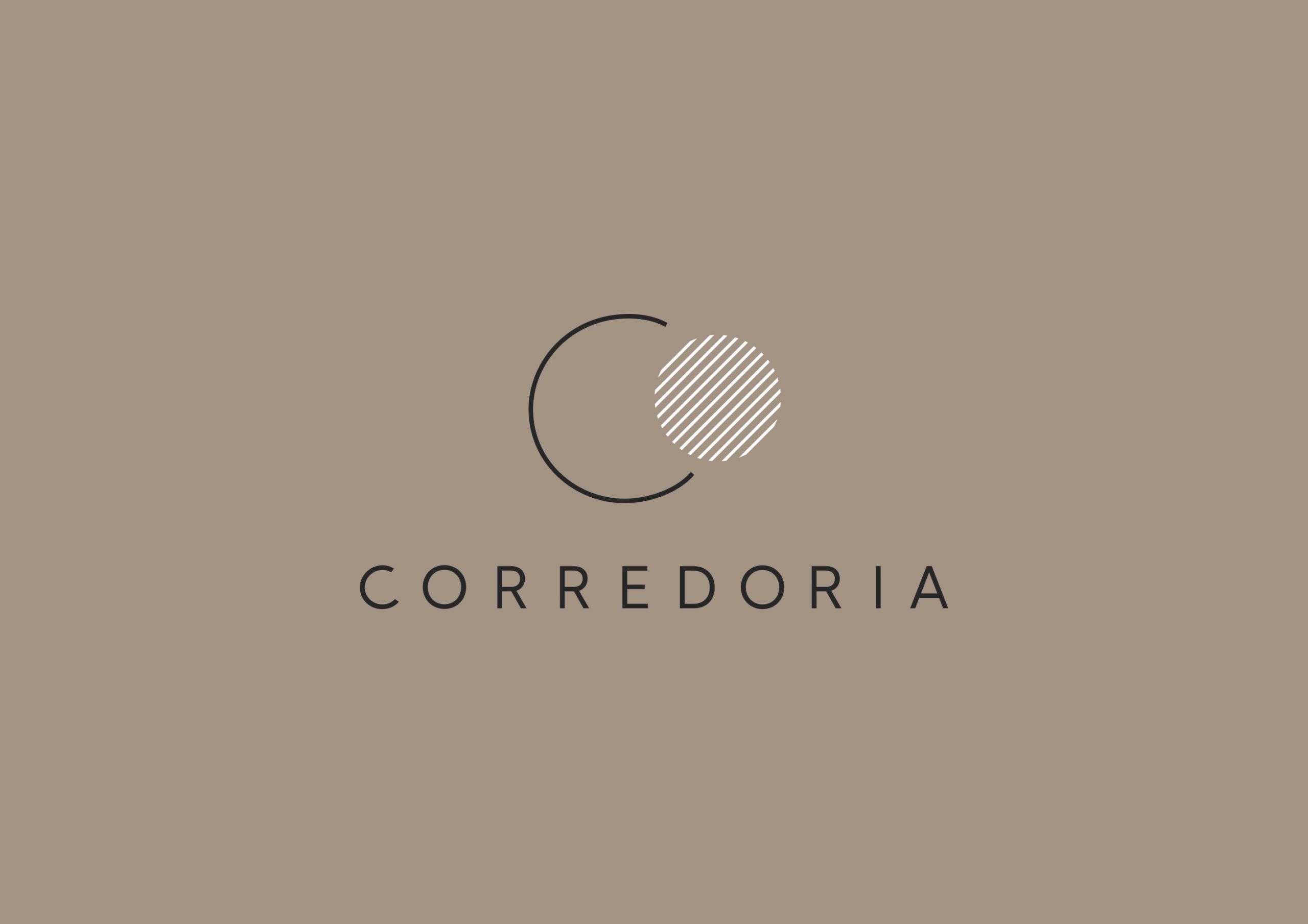
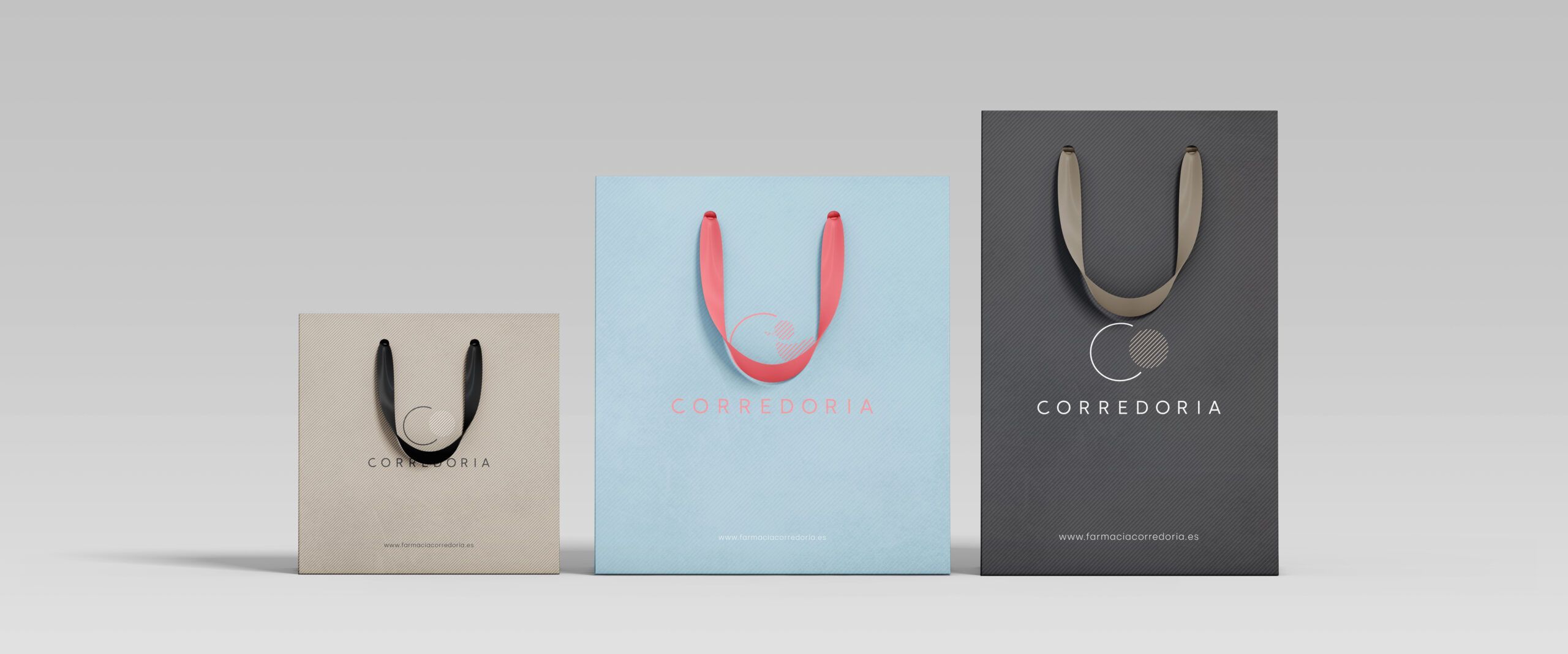
On the one hand the logotype (written part of the brand). It is drawn in a Sans Serif typography created from the Silka font, in which the characters have been polished to improve legibility (necessary as it is a long word) and its shapes to gain in elegance and obtain a more minimalist appearance.
The isotype (imagotype or icon) is framed in a circle formed by a C-shaped line (of Corredoria) that embraces another circle in the form of a woven O that adds elegance and modernity to the whole. This set creates a ‘stamp’ that gives the brand symbolism of quality and experience.
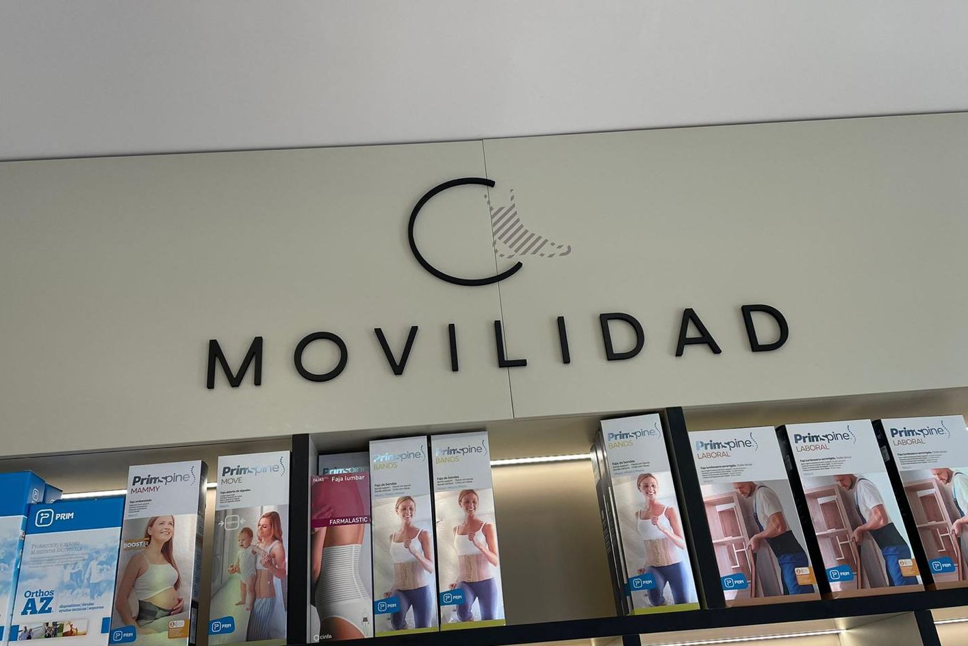
The circle of the main brand is transformed into the symbol that in each case defines the section and which will change according to the section to give it a global character. The symbols are ‘off-centre’ from their supposed middle position in the circle, in a wink to the name Corredoria, which, translated into Spanish, would be corredera.
Finally, in the case of the sections, the brand closes with the word that defines the section in a Serif typography that adds a point of elegance to the whole while complementing the definition of the section.
BEFORE
AFTER
In its growth and improvement to cover all the needs of its customers, Corredoria is already much more than a pharmacy, so in its new image it does not need to limit its field to the pharmacy exclusively.