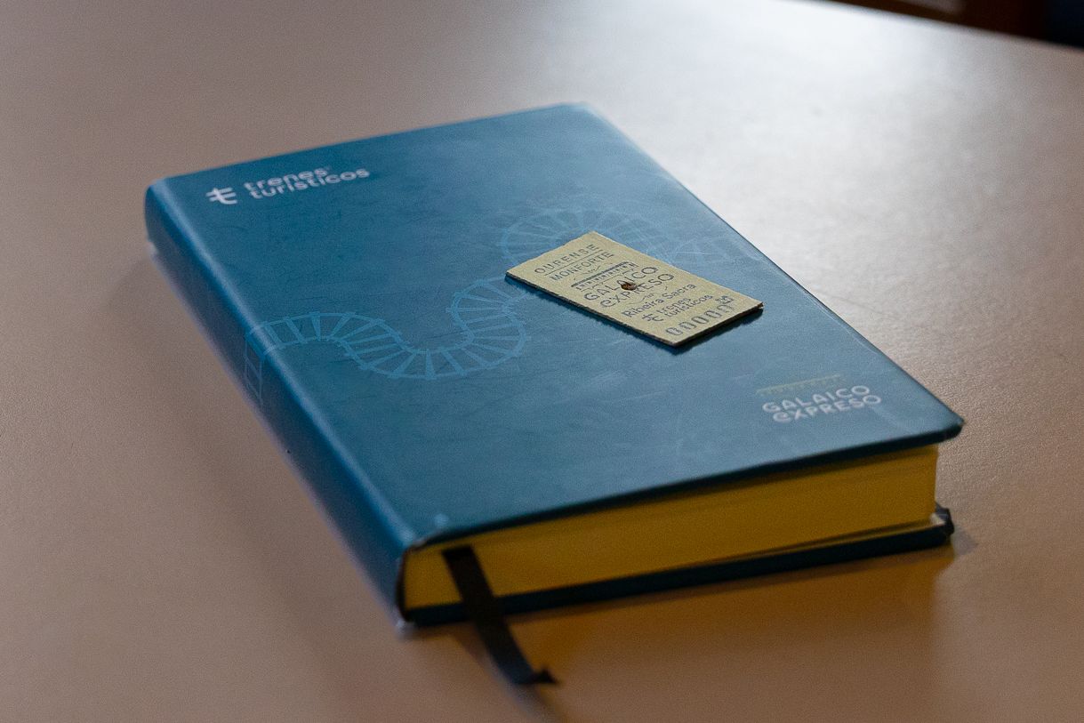



A visual identity for a railway journey that explores Galicia from a leisurely, evocative perspective, deeply connected to the land.
We designed a brand capable of uniting the Atlantic landscape, culture, gastronomy, and tradition in an elegant, recognizable graphic system adaptable to different itineraries and media.
The Galaico Expreso brand was born from the desire to transform the train journey into a unique visual narrative. To achieve this, we developed an identity inspired by Galician graphic culture, drawing on the work of the Laboratorio de Formas de Galicia (Galician Forms Laboratory) and its pursuit of a visual expression linked to the heritage, typography, and memory of the region.
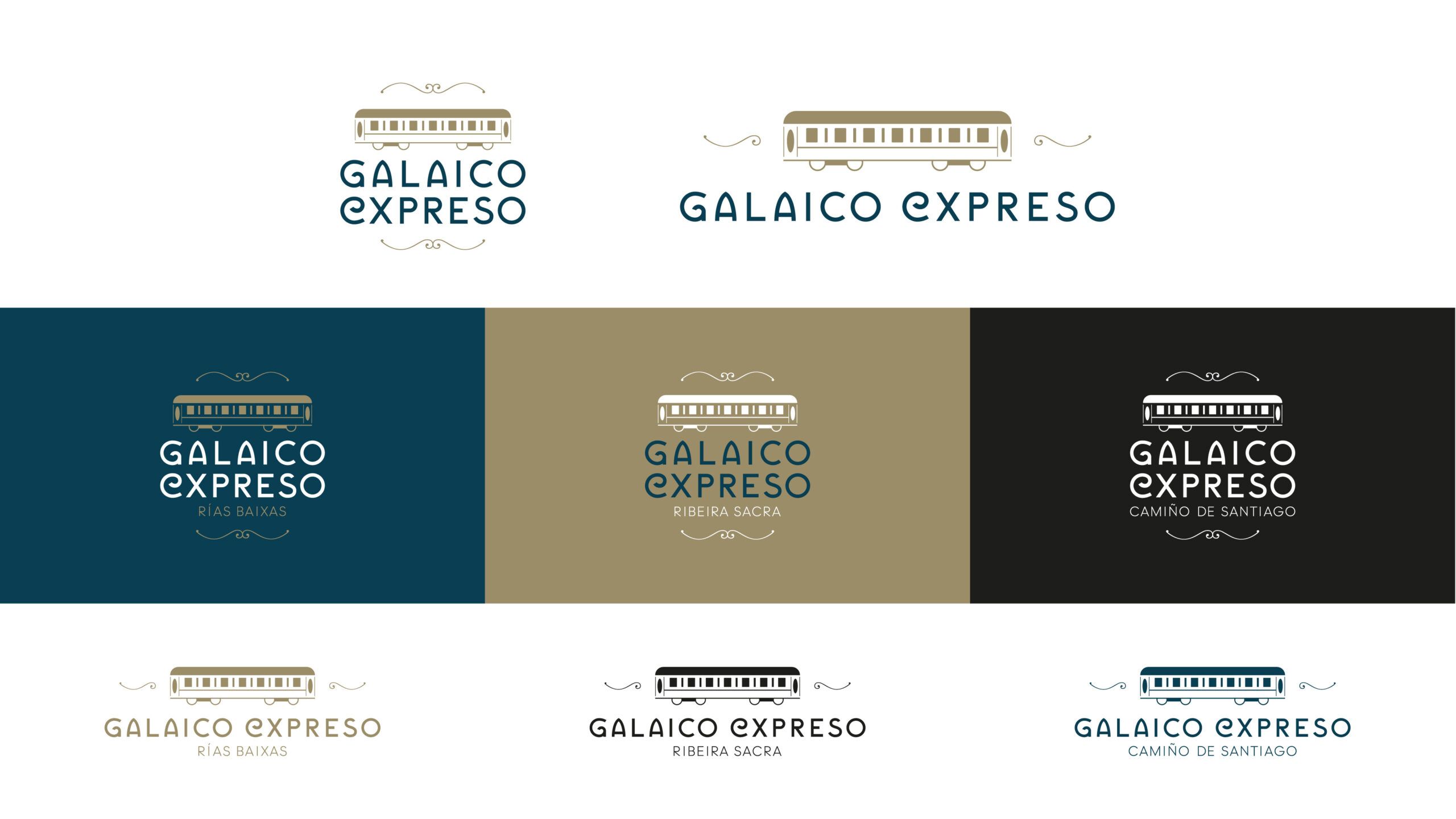
The logo is built upon a custom typeface, in which certain characters take on symbolic and ornamental value. The brand is completed with an illustration of a classic train carriage, evoking the imagery of grand railway journeys and the graphic design of Trenes Turísticos (Tourist Trains).
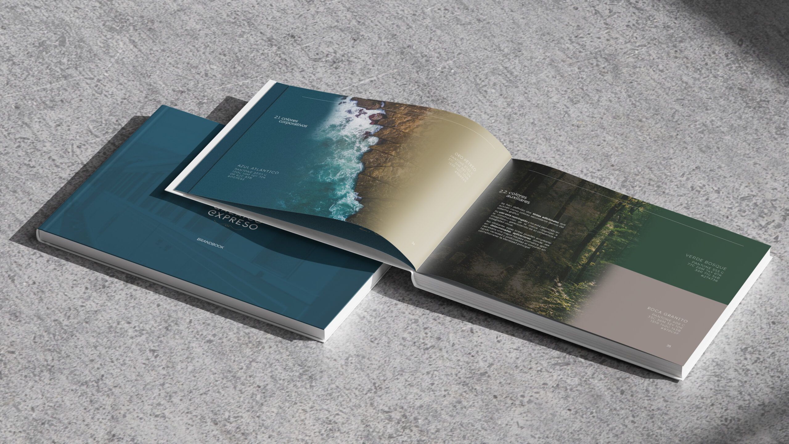
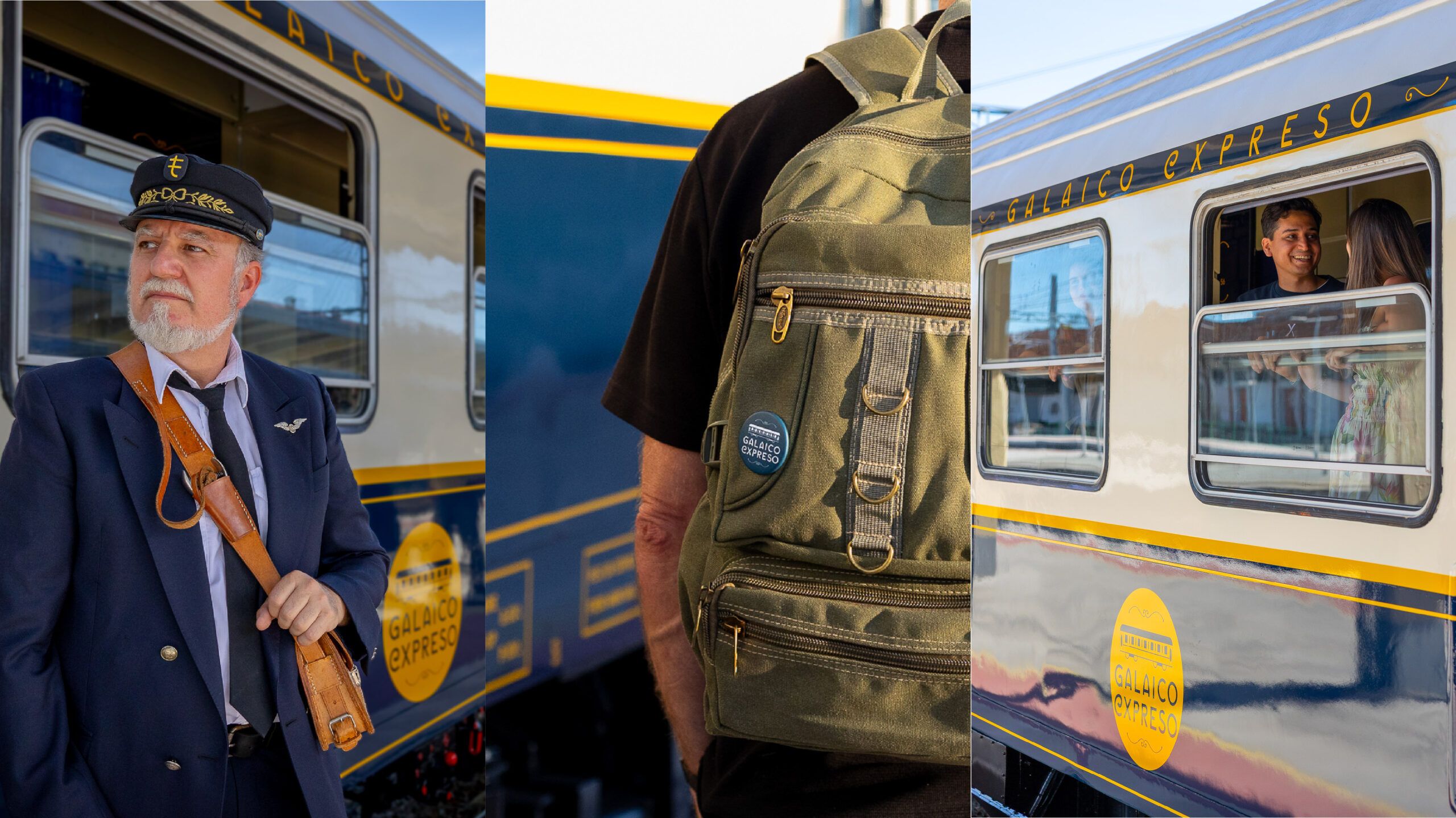
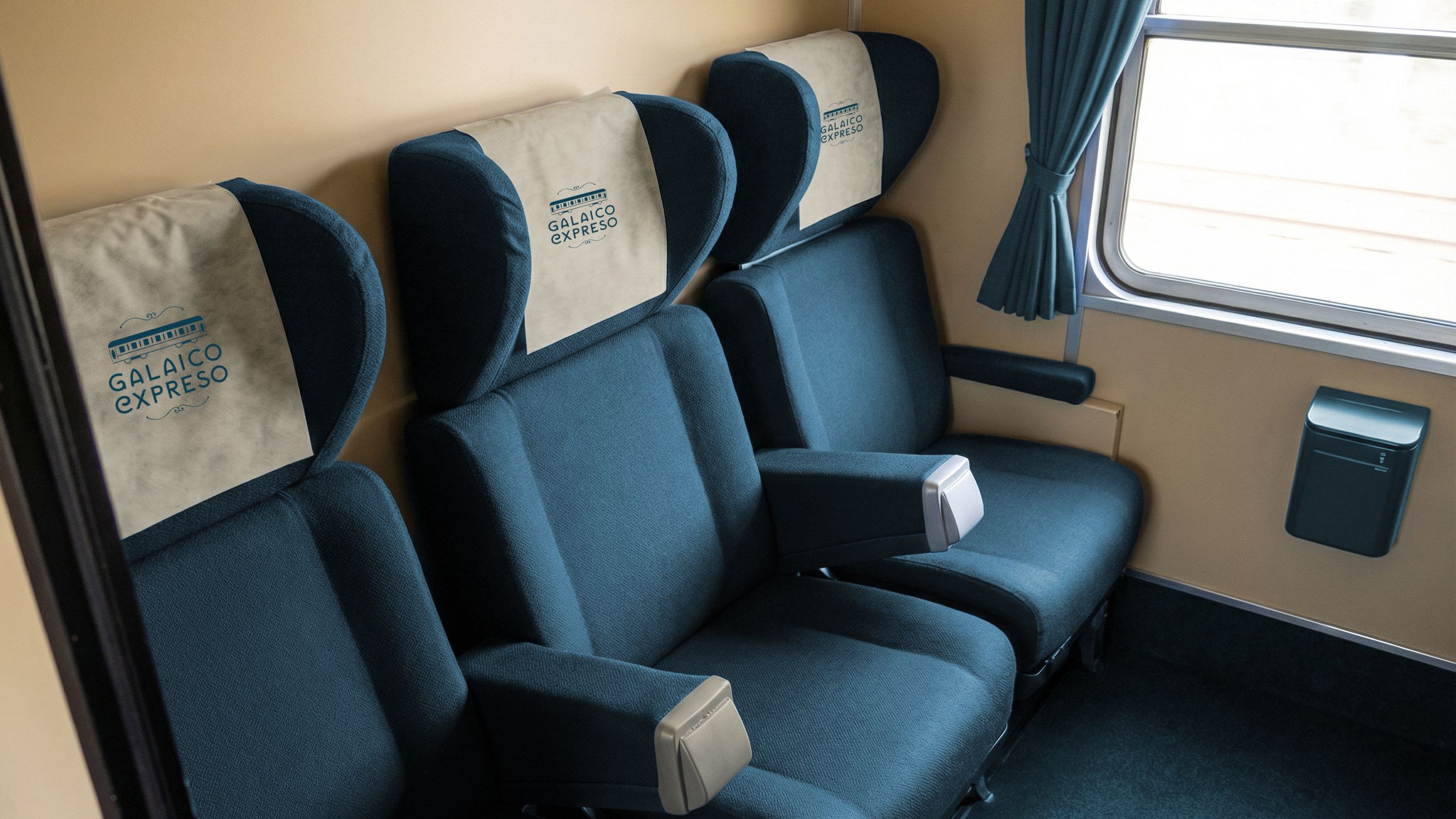
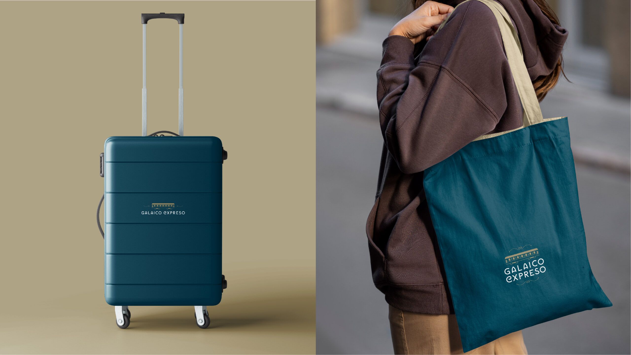
The color palette, based on Atlantic, stony, and natural tones, reinforces the calm and experiential character of the project. The result is a versatile identity, with versions adapted to different routes—Rías Baixas, Ribeira Sacra, or the Camino de Santiago—and designed to be used across digital media, physical applications, promotional materials, and elements related to the train itself.
A brand that transforms the train journey through Galicia into a visual experience where landscape, culture and tradition advance on the same rail.