

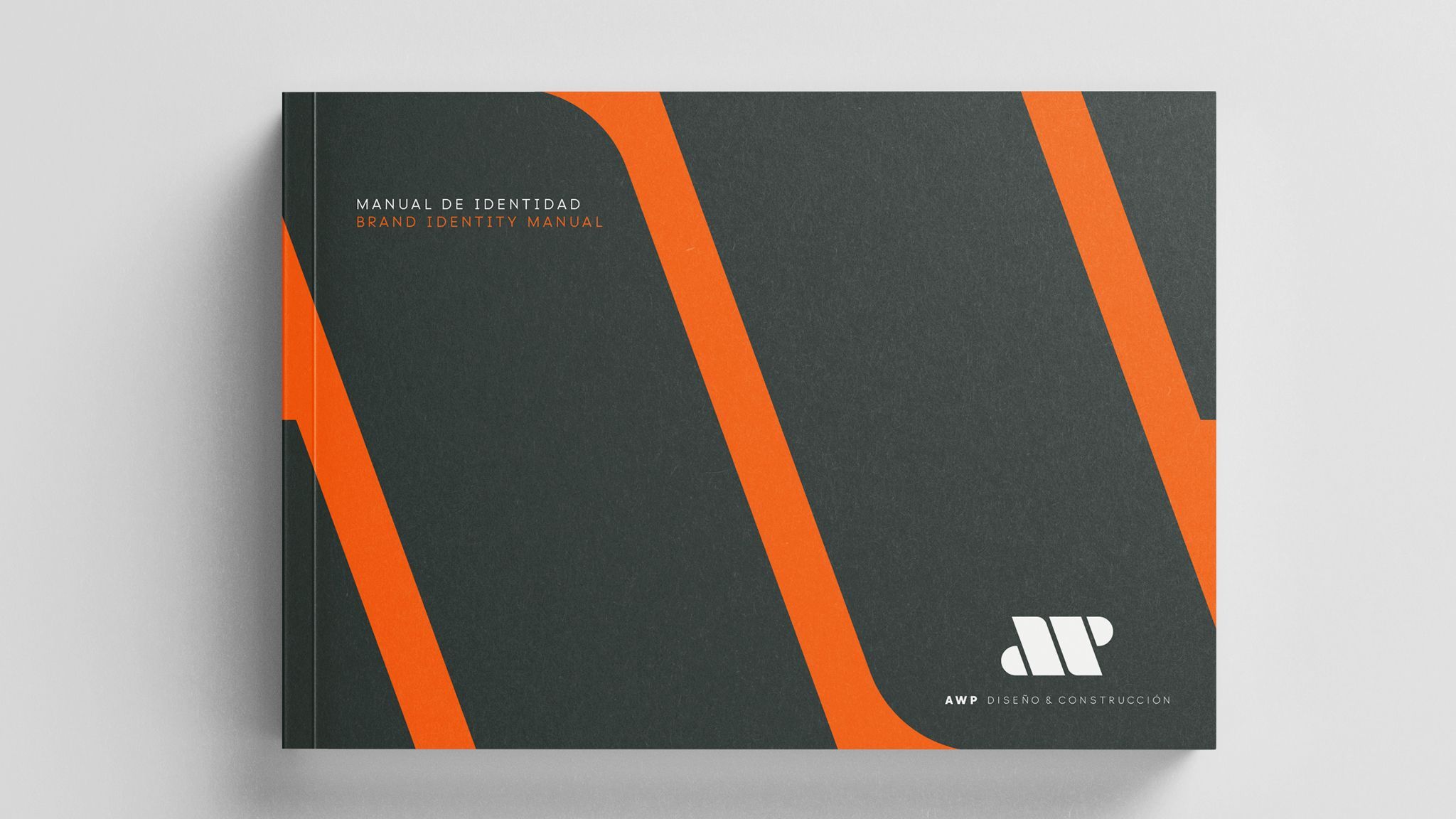

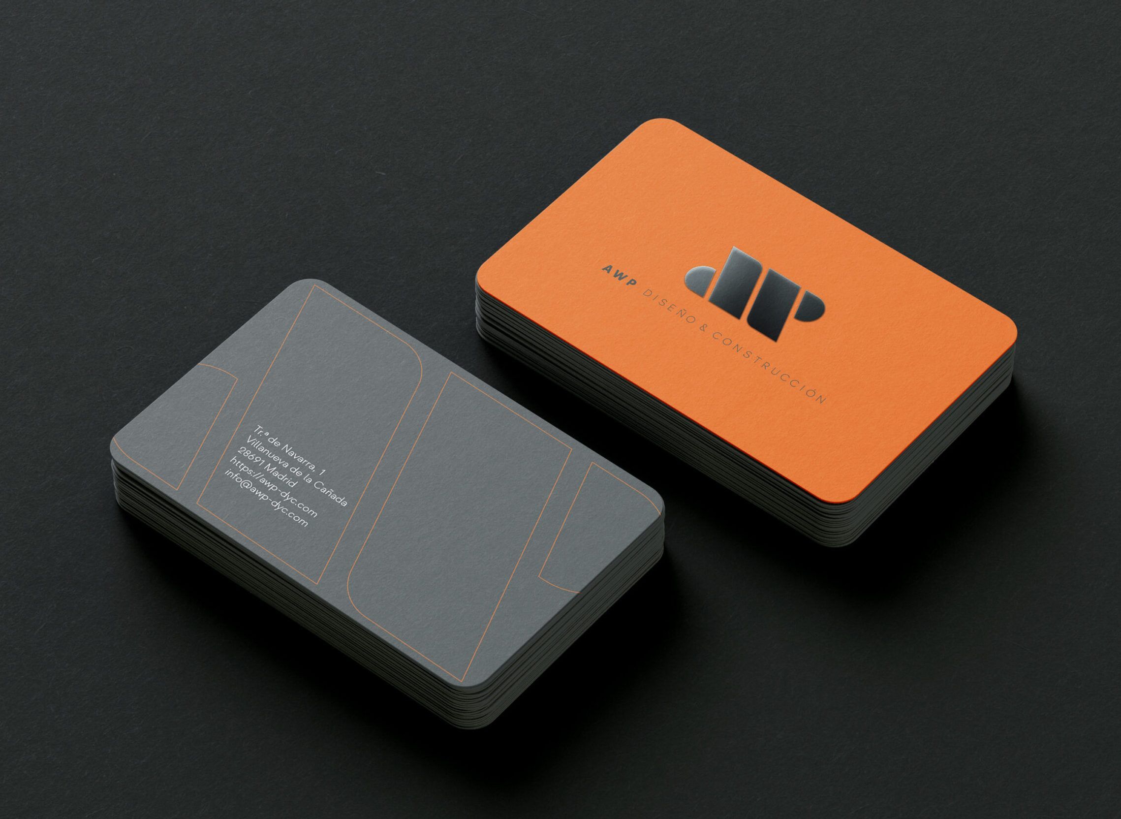




AWP is a consultancy that has made a leap into the construction and design sector of living, commercial and industrial spaces. Although its name already existed, this new step is accompanied by a visual identity in line with its scope of work and the maxims that govern the operation of the company: experience, quality and trust.
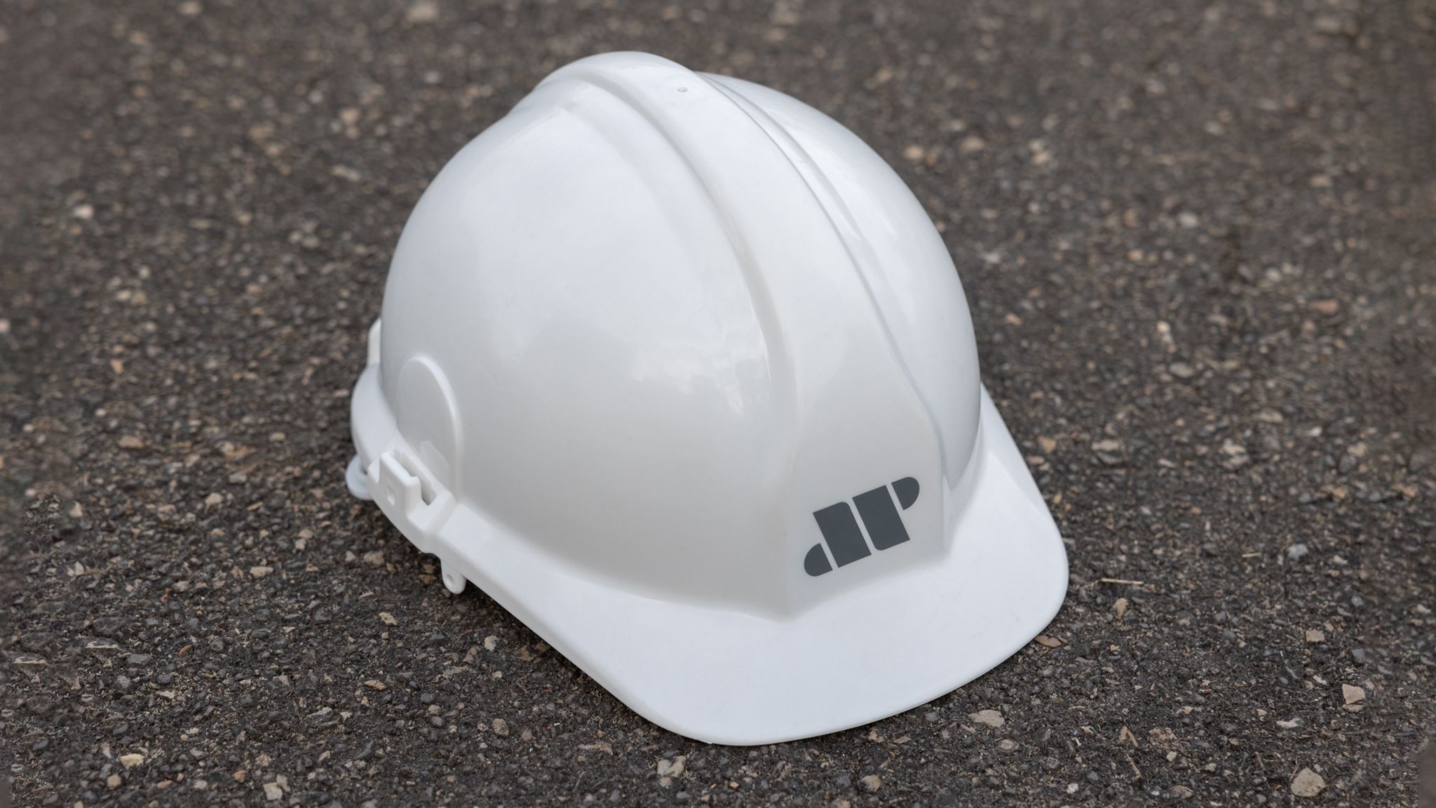
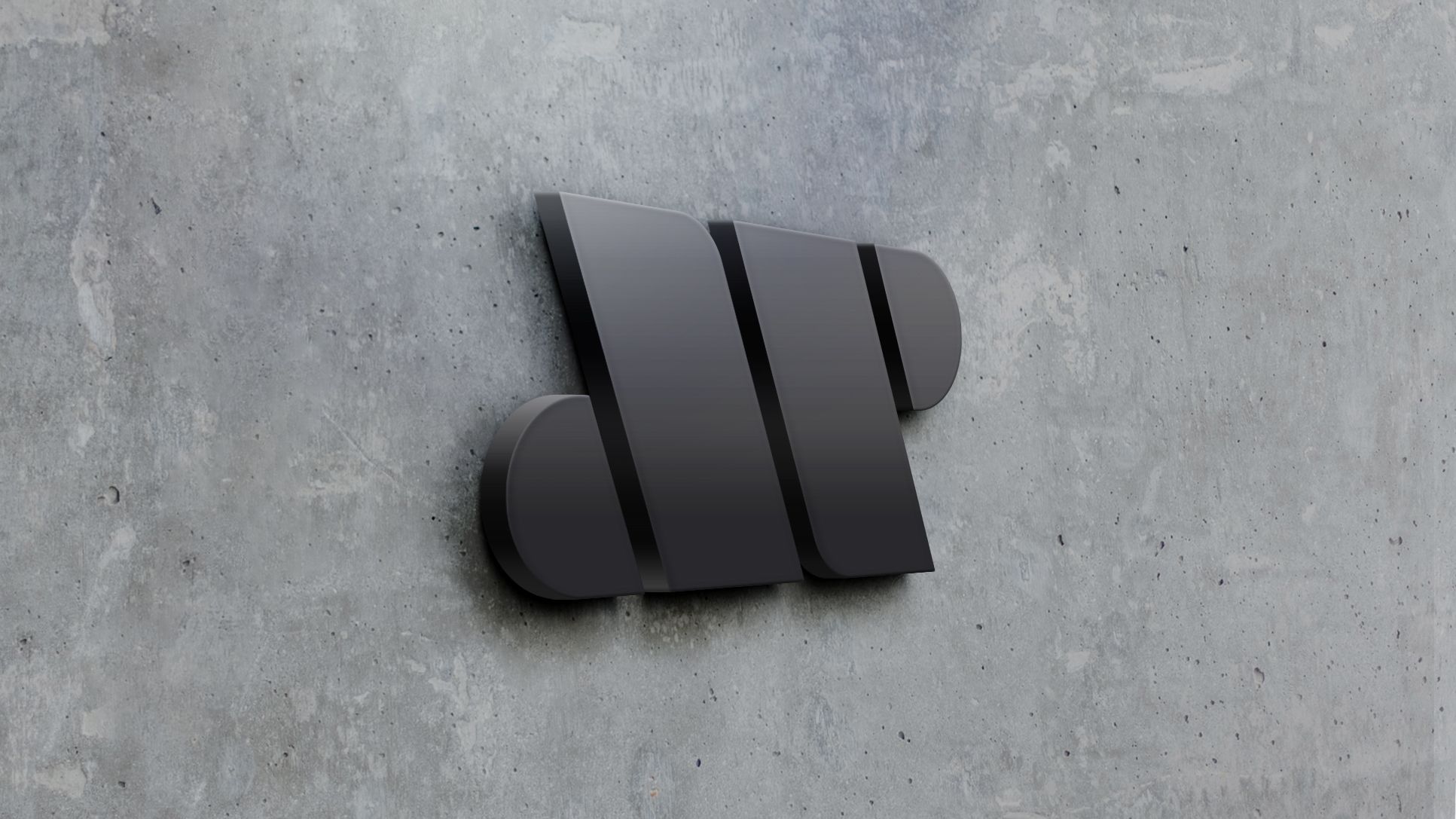
The brand image is based on the concept that ‘a work is the assembly of works, people, processes… that generate a whole, a unified final solution’. In this way, the AWP isotype is constructed from 4 graphic forms, which in turn are mirrored two by two, a set with its own meaning: the AWP anagram, but which also generates in its final form a block symbolising strength and resistance, while denoting movement and capacity for adaptation, forming a visual palindrome that when turned over takes on an identical form again.
This forceful block rests on top of the logotype, in a line of text that extends as a horizon on which the anagram rises, generating the image of an architectural elevation. The logo is based on the Strawford typeface, in its black and light weights, but optical adjustments have been made to improve legibility.
The colour palette starts with the power of orange, which brings liveliness and audacity and is complemented by cement grey, which alludes to the strength and power of building materials, and brings elegance to the application of the image.