

A brand refresh for a company with 70 years’ experience in the design and manufacture of knife handles, a leading name in its sector both nationally and internationally.
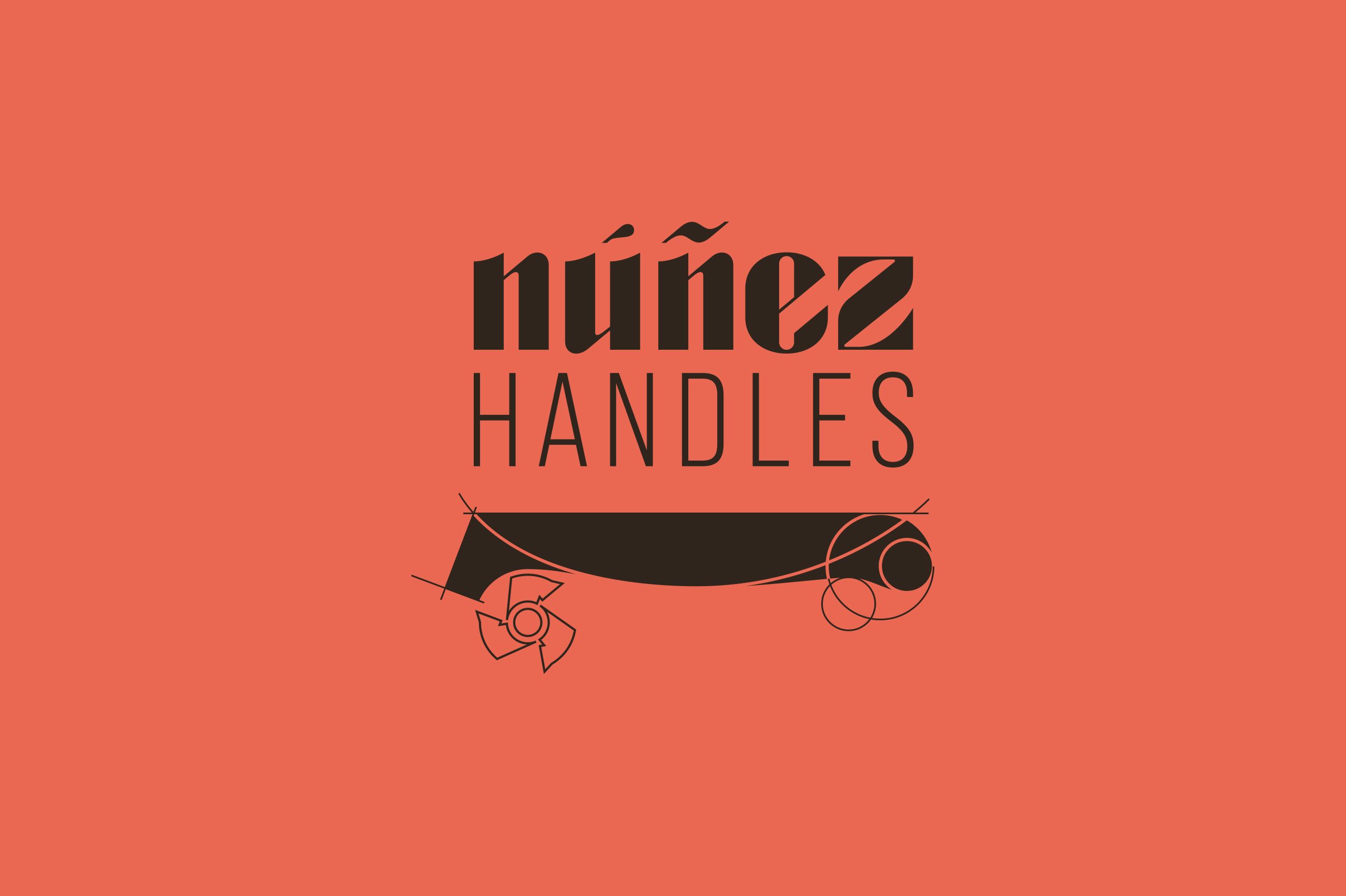
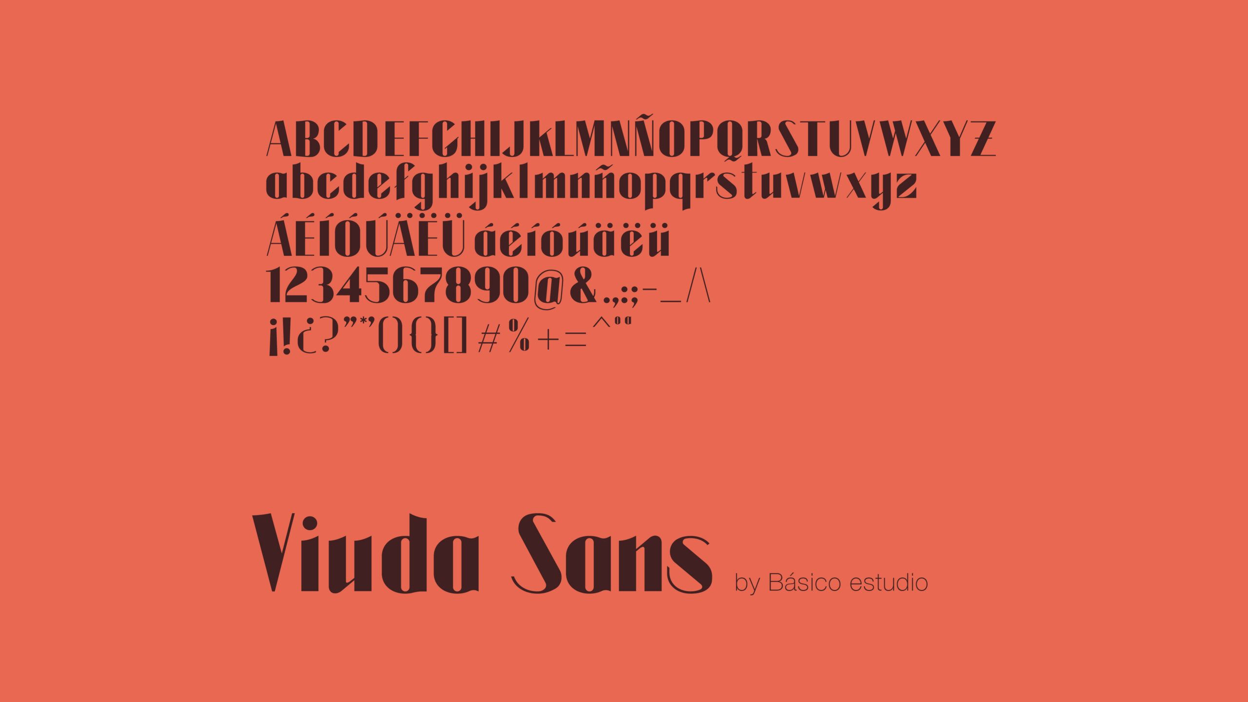
The project stems from the need to organise and update a brand identity that had evolved over time without a fully defined graphic system. To this end, a new logo was developed based on a typeface created exclusively for the brand, which retains its classic roots whilst introducing a more distinctive, contemporary and unique character. This new logo and the update to the brand mark pave the way towards a more robust, recognisable and modern visual identity, capable of preserving the essence of Núñez Handles whilst adapting it to the brand’s new communication needs.
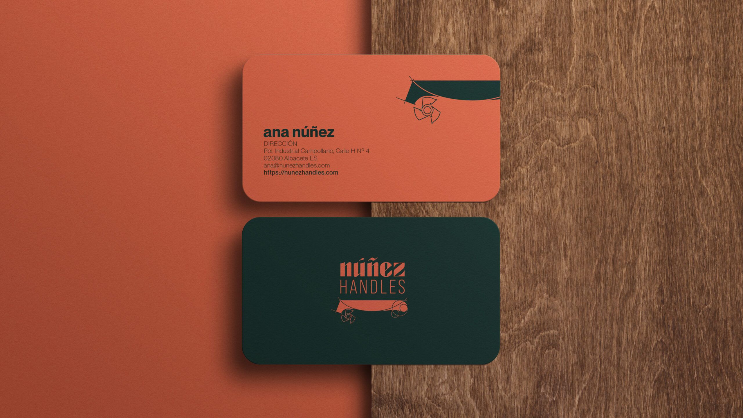
The word ‘Handles’ is rendered in a typeface with cleaner, more contemporary lines, clearly signifying the company’s area of specialisation. Meanwhile, the isotype has been simplified by removing photographic elements and emphasising its linear features, resulting in a symbol that is more versatile, legible and suitable for use across all types of applications.
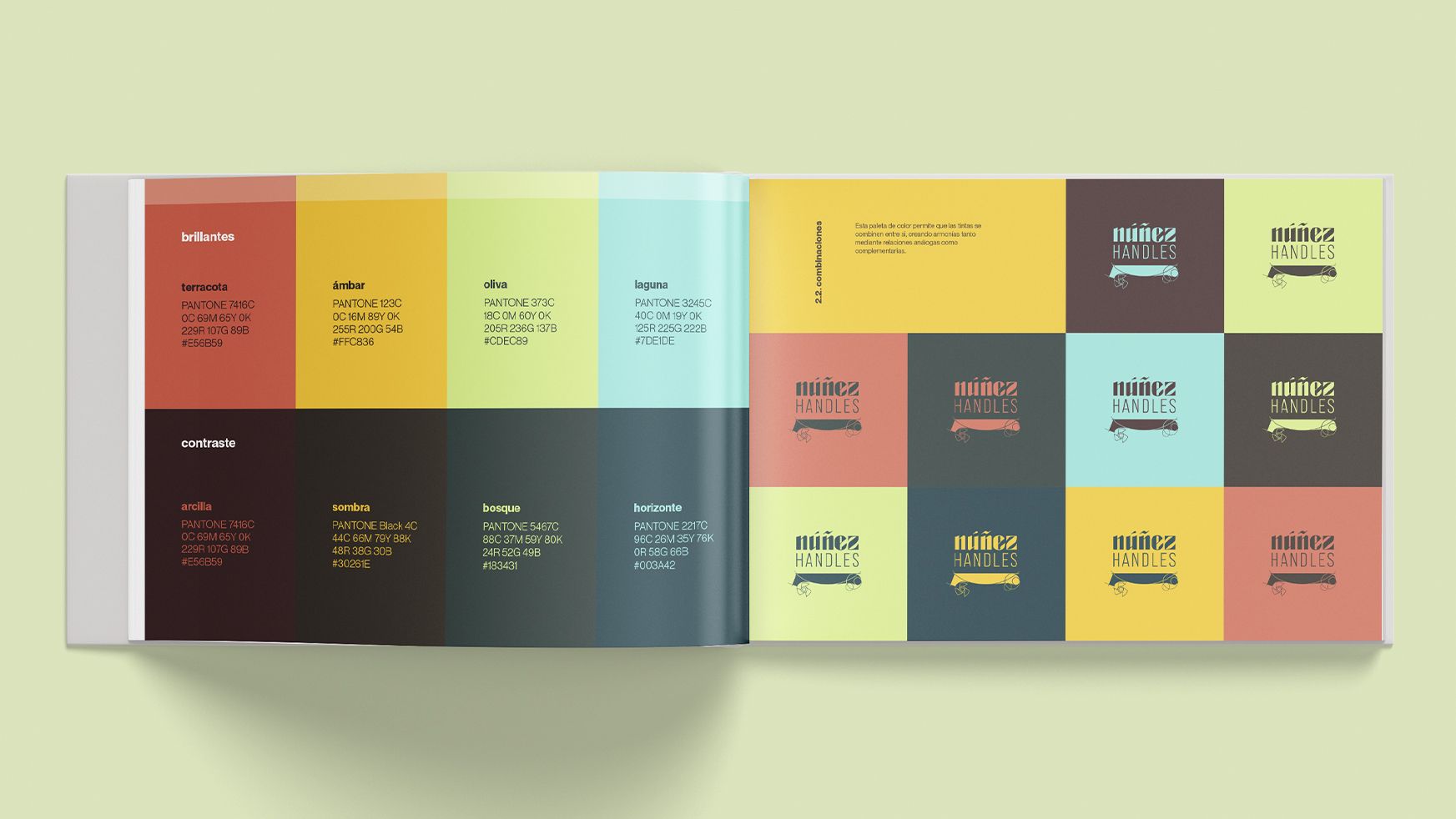
The new colour palette combines elegant contrasting tones with fresher, more expressive colours, lending visual impact and flexibility to the system. The result is a refreshed, powerful and consistent identity that showcases Núñez Handles’ expertise and positions it for a more professional, international and contemporary approach to communication.
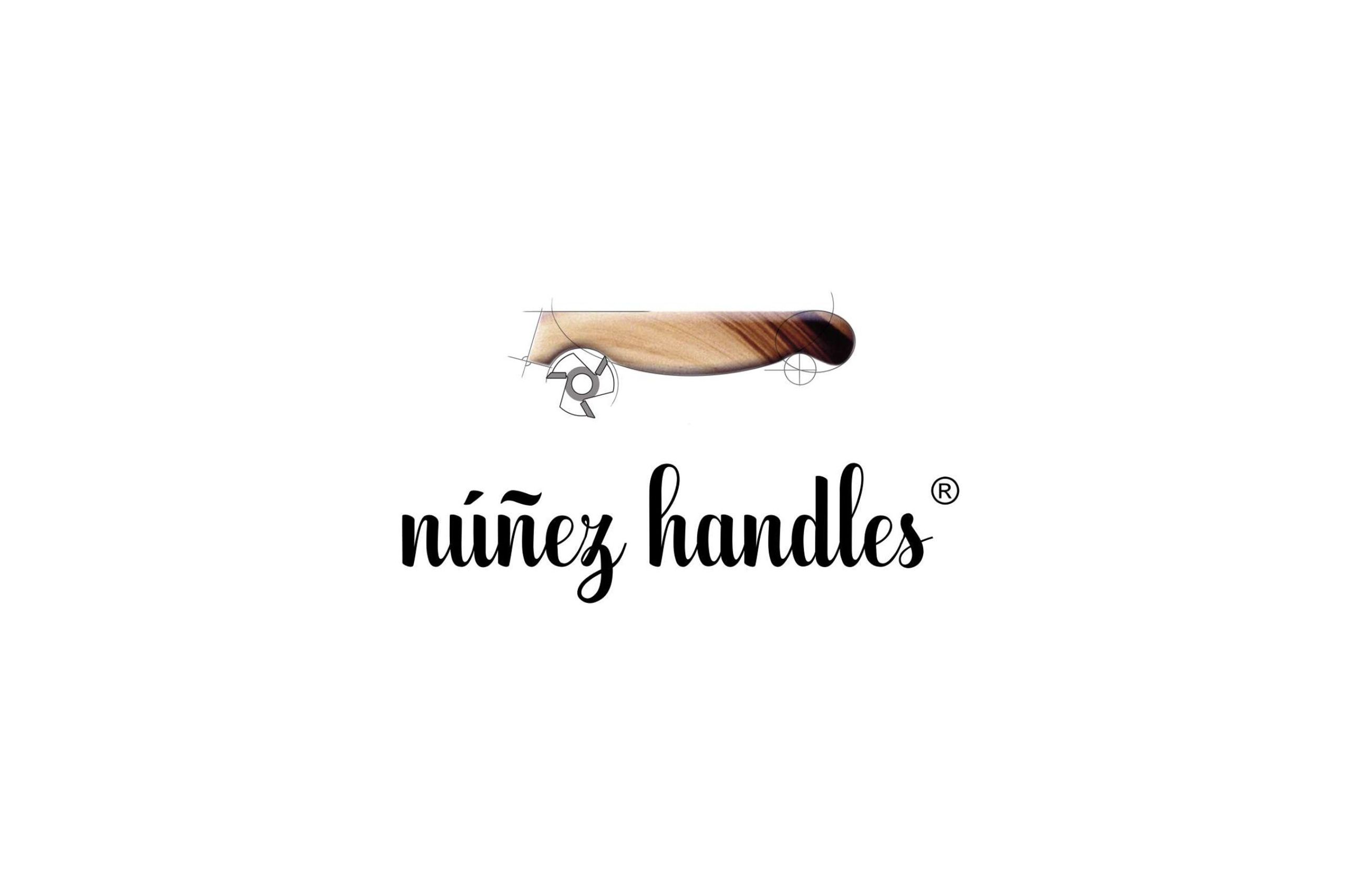
BEFORE
AFTER
A visual identity that brings 70 years of history into the modern era without losing the essence of a brand specialising in knife handles.