
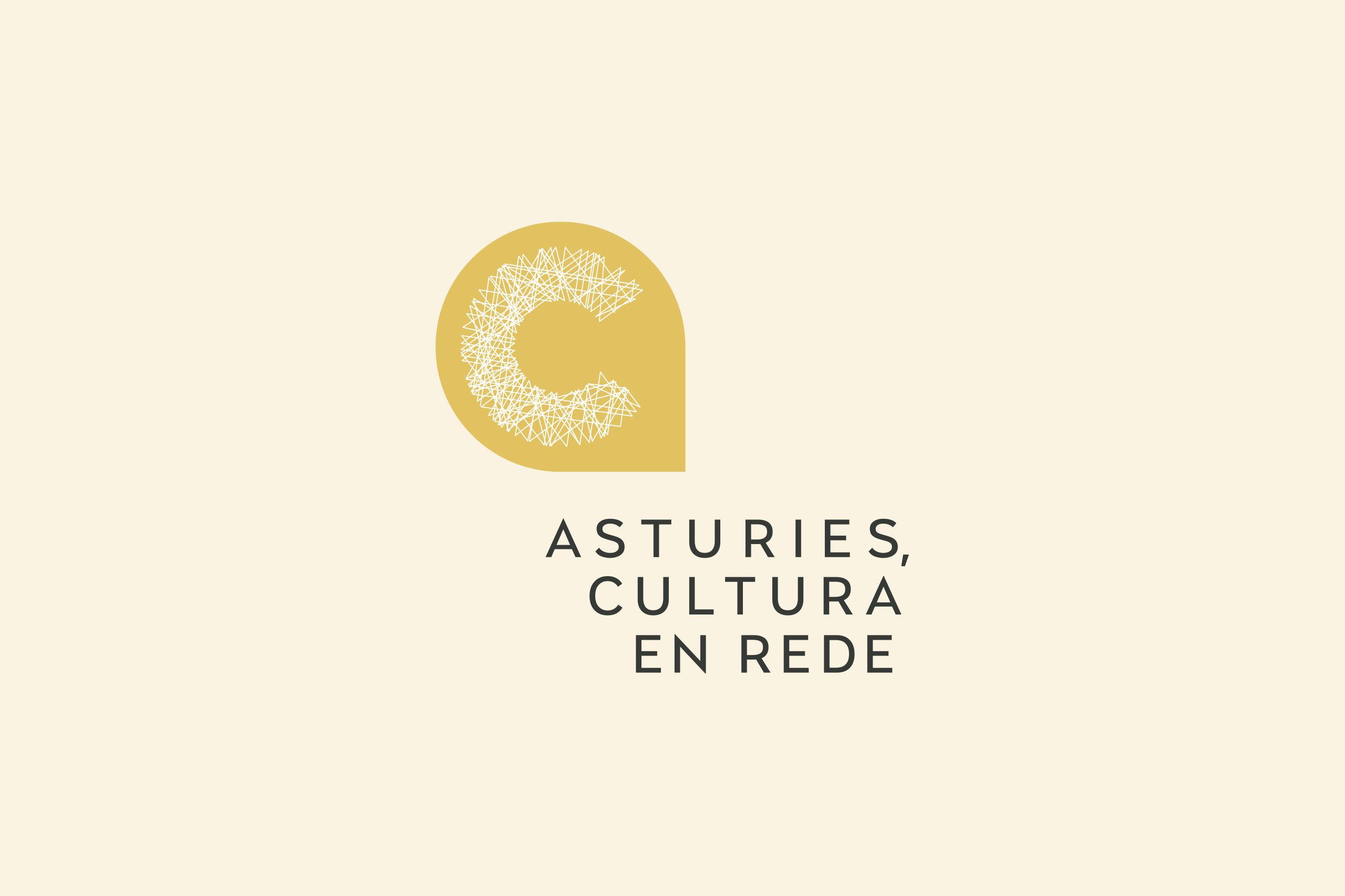
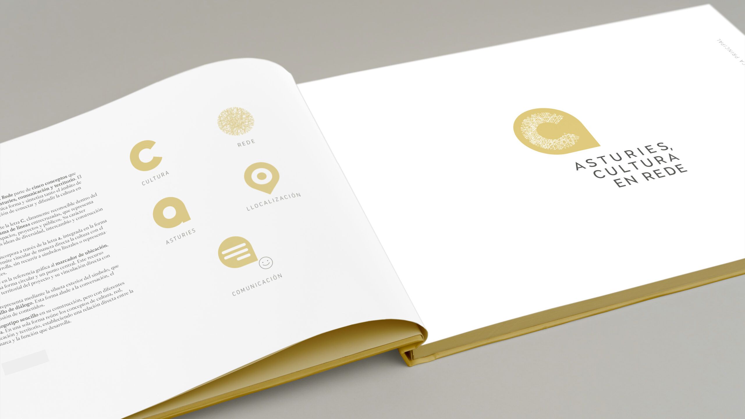





The identity of Asturies, Cultura en Rede is based on five concepts that define the project: culture, network, Asturias, communication and territory.
The logo brings these ideas together in a single form and encapsulates both the brand’s scope of activity and its role in connecting and promoting culture in Asturias.
Culture is represented by the letter C, which is clearly recognisable within the symbol. The network is depicted in the pattern of intersecting lines, representing the connections between stakeholders, spaces, projects and audiences. Its irregular and organic nature reinforces the ideas of diversity, exchange and collective creation.
The reference to Asturias is incorporated through the letter ‘a’, integrated into the overall shape of the logo, which allows culture to be directly linked to the region in which it flourishes, without resorting to literal symbols or obvious geographical representations.
The region is recognised in the graphic reference to the location marker, constructed from a circular shape and a central point. This element introduces the project’s regional dimension and its direct link to Asturias.
Communication is represented by the outer outline of the symbol, which resembles a speech bubble. This shape alludes to conversation, exchange and the dissemination of content.
BEFORE
AFTER
The result is a logo that is simple in design but offers multiple levels of interpretation. In a single shape, it brings together the concepts of culture, network, Asturias, communication and territory, establishing a direct link between the brand’s identity and the role it plays.