


The Orbayu is the name given in Asturias to the very fine, barely perceptible drops of rain that are so characteristic of its meteorology. On orbayu days, the Asturian landscape evokes images of British lands and the ambient humidity refreshes like the sip of a well-prepared Gin Tonic.
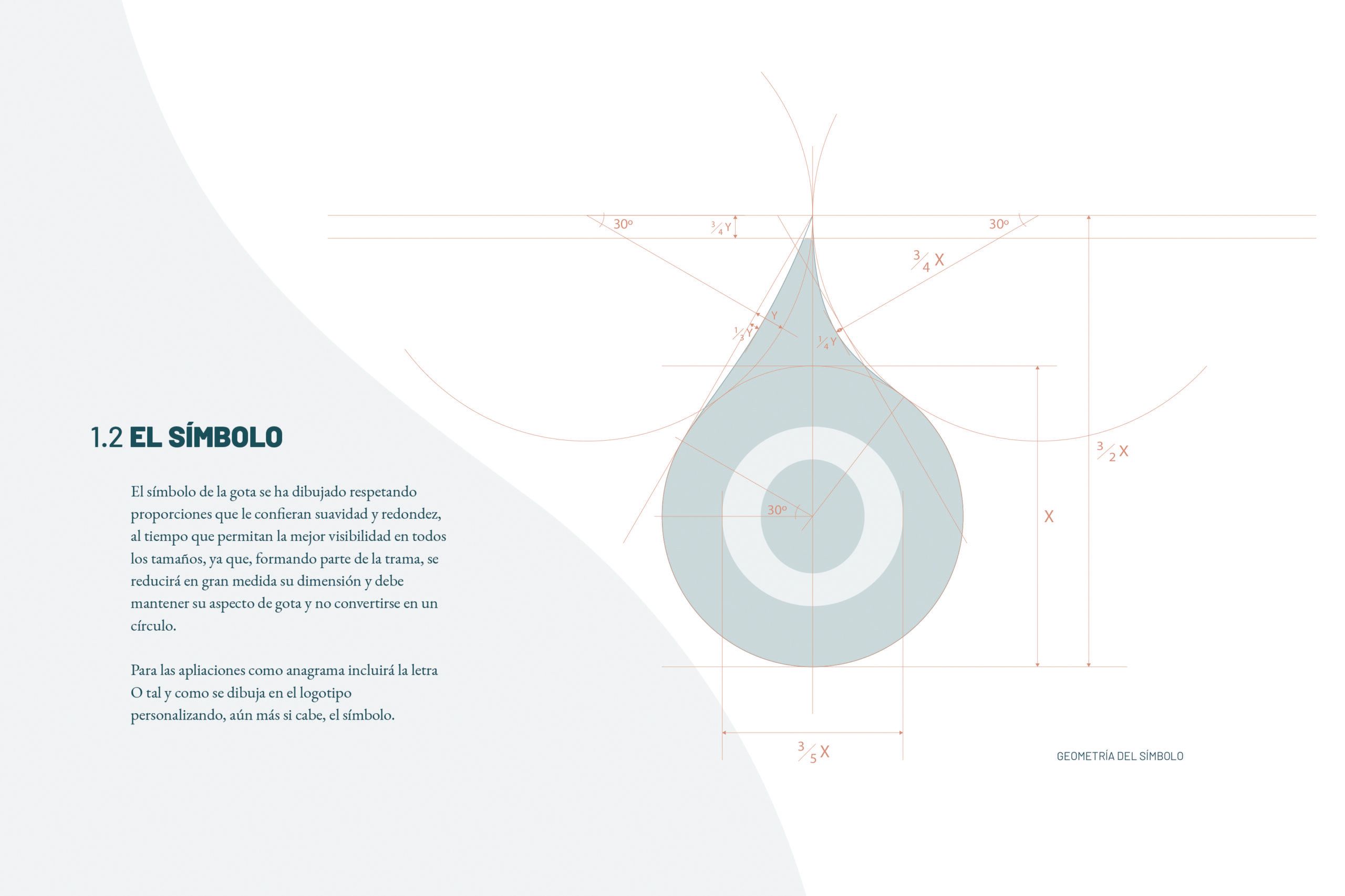
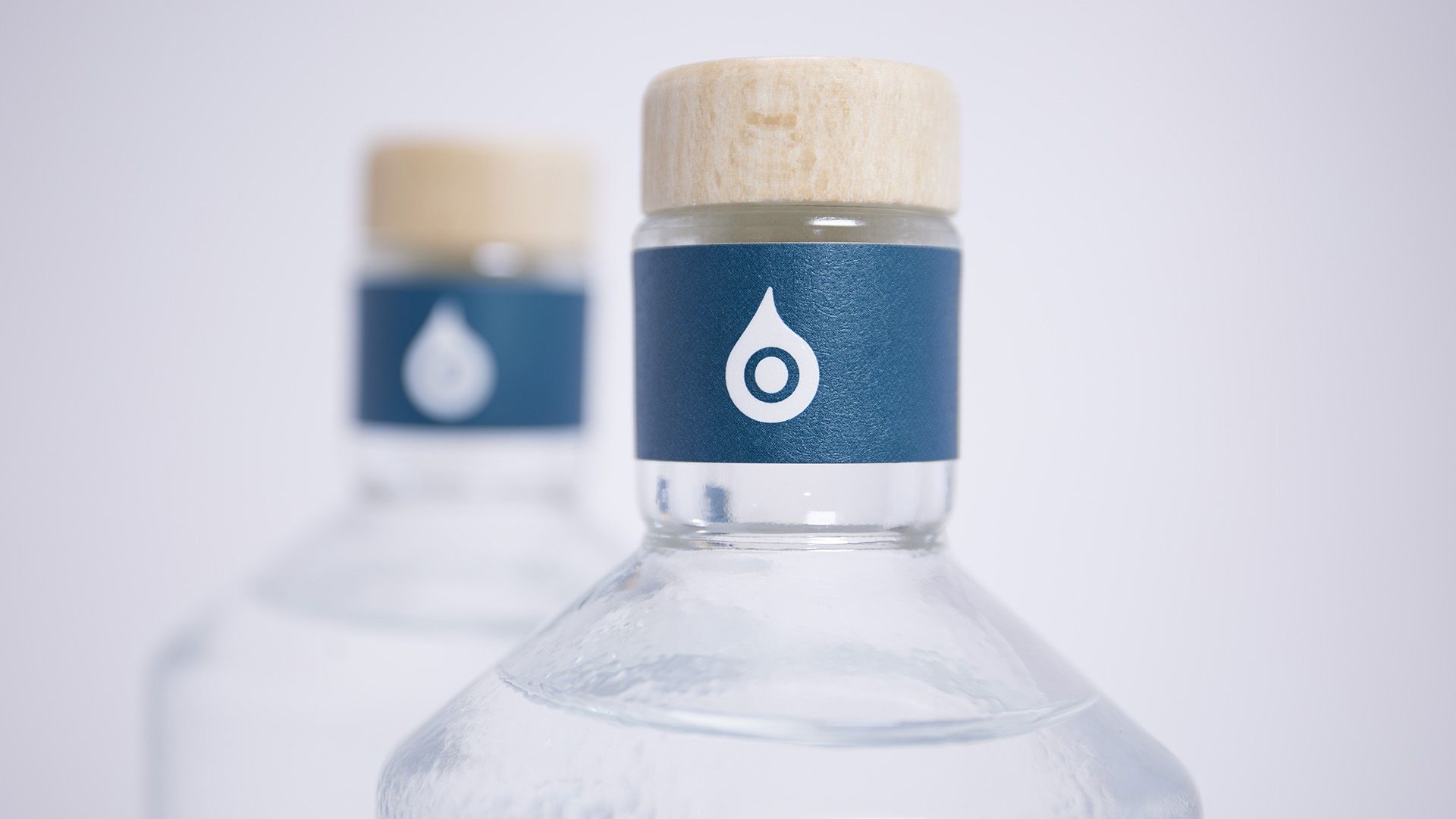
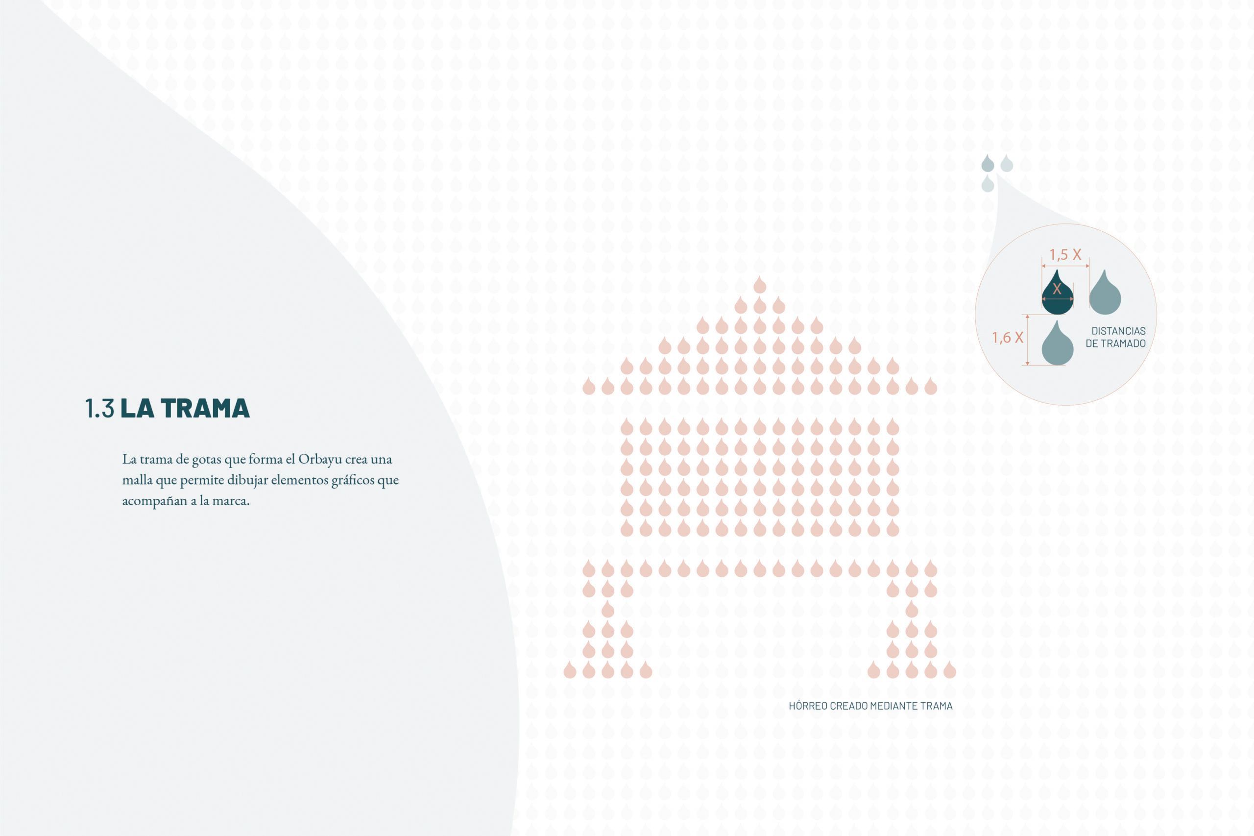
When creating the symbol that would define Orbayu Gin, we looked for that drop that, in millions, makes up the essence of orbayu. We work with it in two ways:
Despite being a classic drink with a great tradition, Orbayu is born with the young and daring spirit of its creators, which is why the colour, typography and shapes that make up its brand are modern, powerful and daring.
The Orbayu brand is made up of:
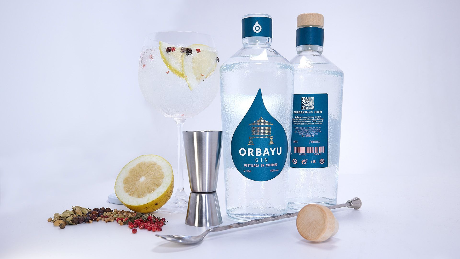
The logo in the form of a woven horreo, which appeals to Asturian tradition and uses the copper colour of the alembic in which the gin is distilled, but is made up with a modern and eye-catching weave that gives it a young and striking counterpoint.
The logo is in turn composed of three described parts: the name of the brand, the description of its product and the claim that defines and personalises it.