
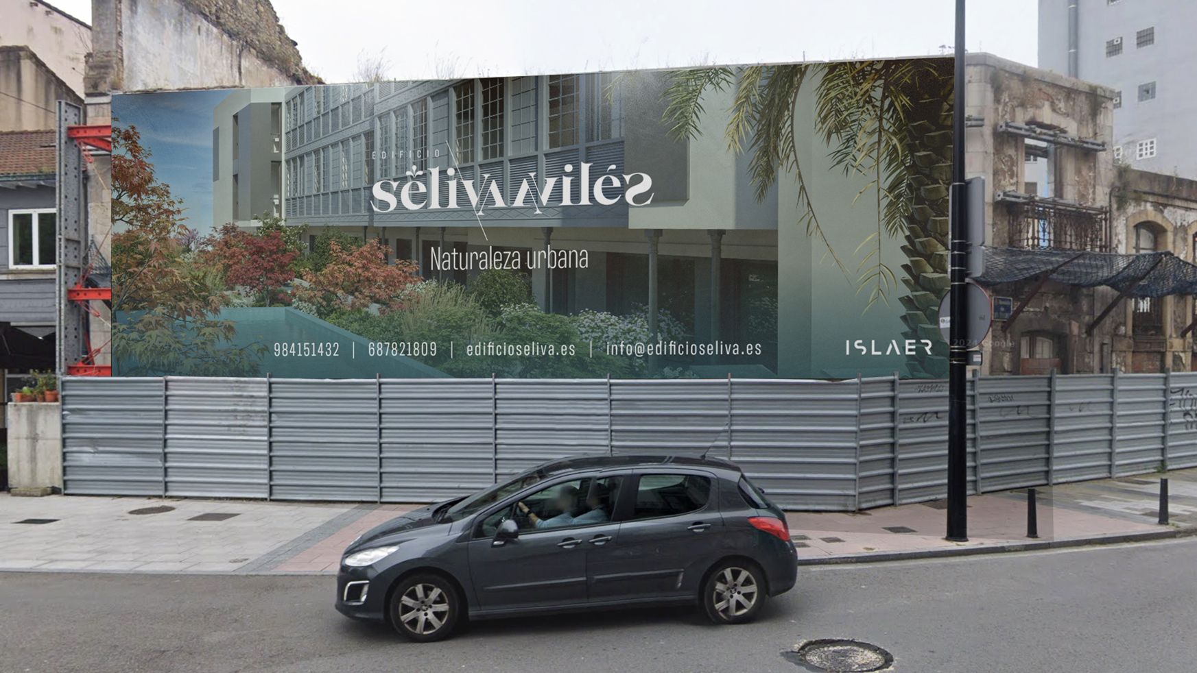



The brief for this Branding and corporate web design work was to create an image for a new building located next to the Avilés estuary, which arises on an existing building, keeping only the design of its front facade.
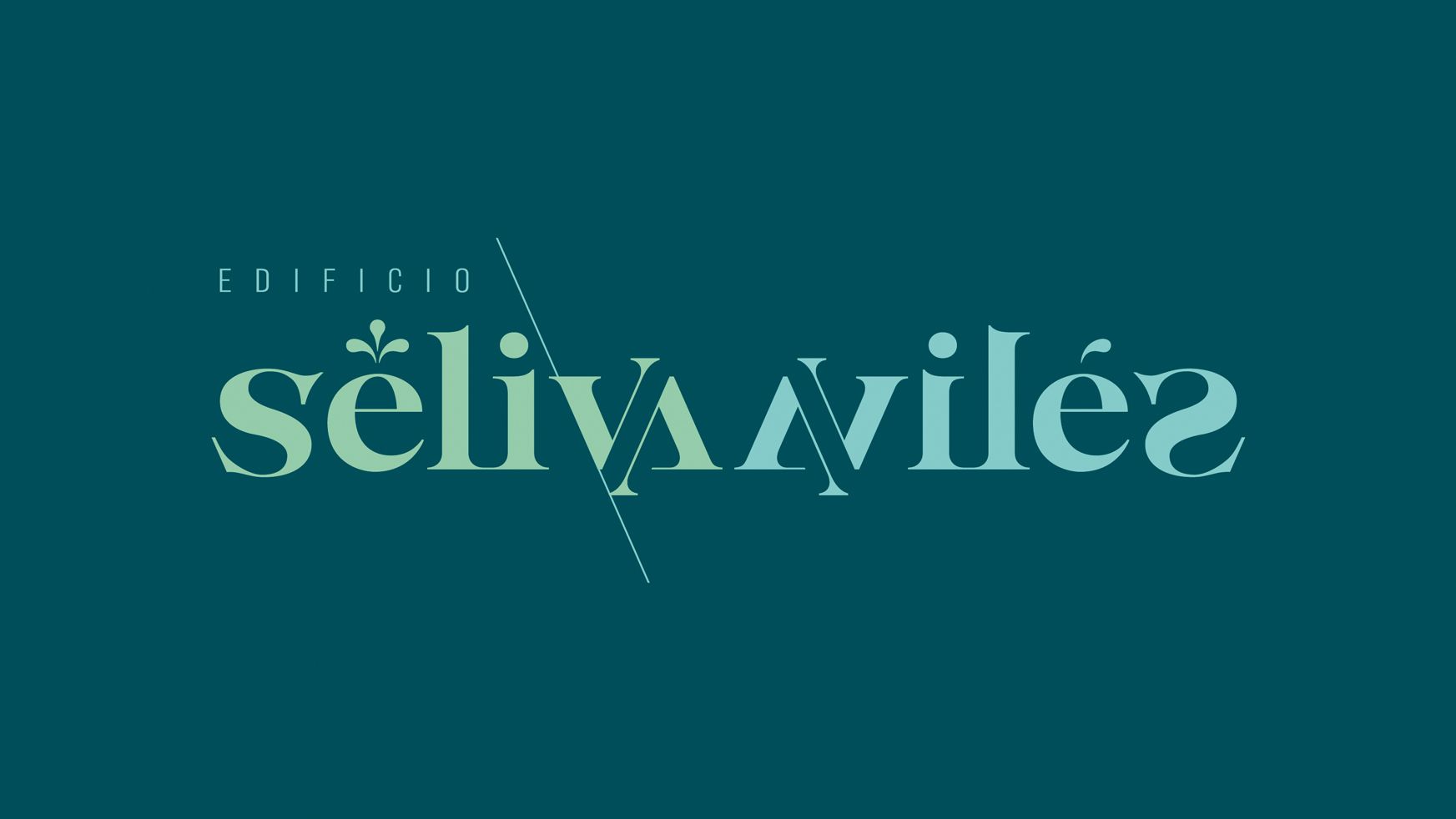
The contrast between the past of the site and the modernity of the new building is already shown in its name: the word Séliva that arises from the reflection of Avilés. At the same time, the location of the building facing the estuary, in the old part of the city, evokes reflections on the water of the building itself and the modern lines of the Niemeyer Center located on the other side.
With the idea of reflection, the brand is created based on the reflections of the different glyphs to create the word séliva, together with its mirror Avilés. We look for winks to the reflection within the characters themselves, between the V and the A… always following the oblique line generated by the diagonals of the V or the A as the axis of reflection. The extension of this axis, starting from the V, works as a graphic support that integrates the word building and brings an architectural idea to the brand. A small detail, the flipping of the letter e, breaks the exact reflection of the word avilés, looking for a better legibility while playing with the observer as an optical illusion.
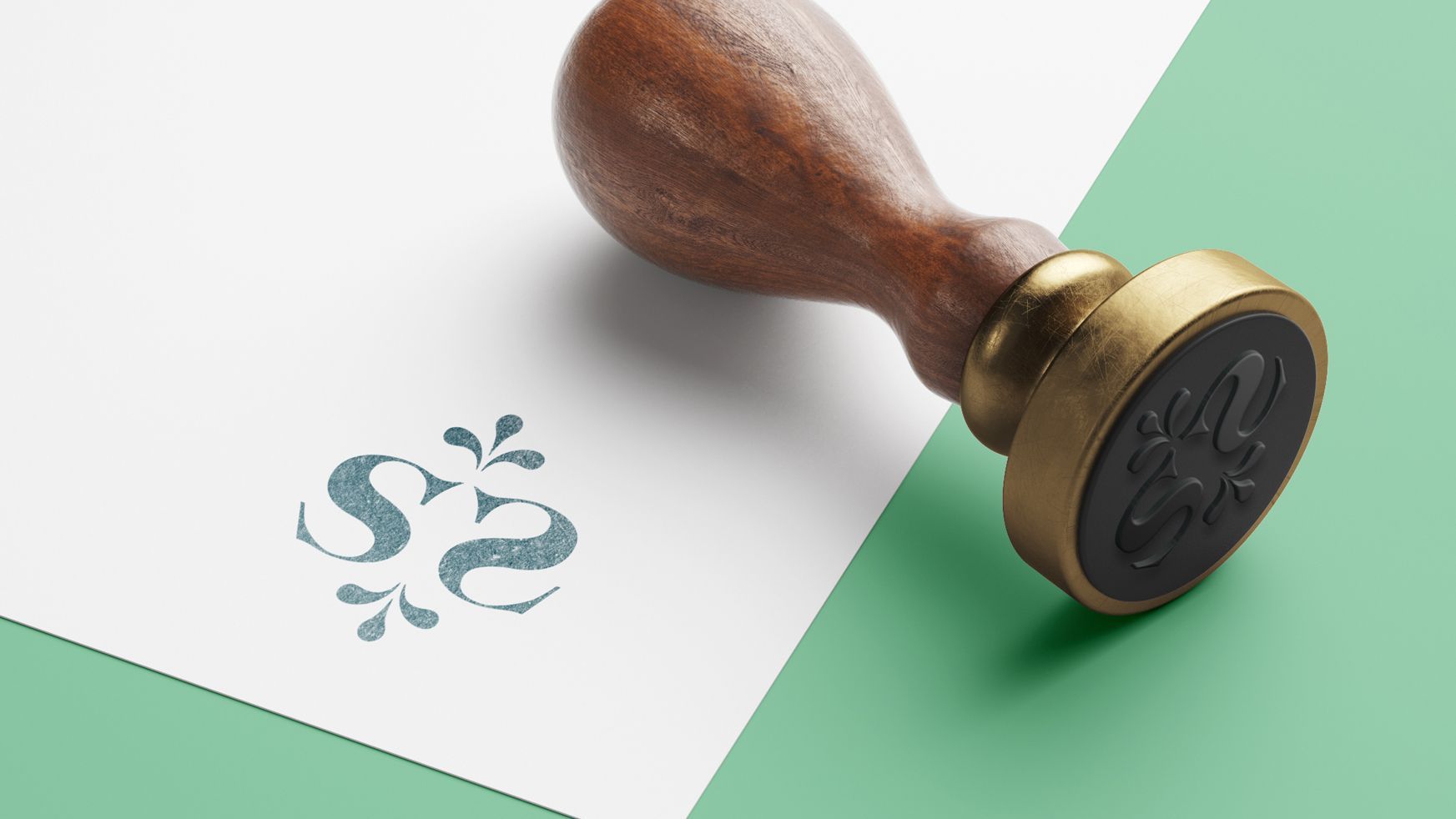
In memory of the Figueroa fountain, which was located on the site on which the building stands, the accent glyph of séliva is replaced by three “jets” that allude to it, one of which is transferred to the word Avilés. The color, English green and blue, alludes to nature, to the interior garden that gives life to the building and to the water of the estuary and the sea, roots of the city of Aviles.
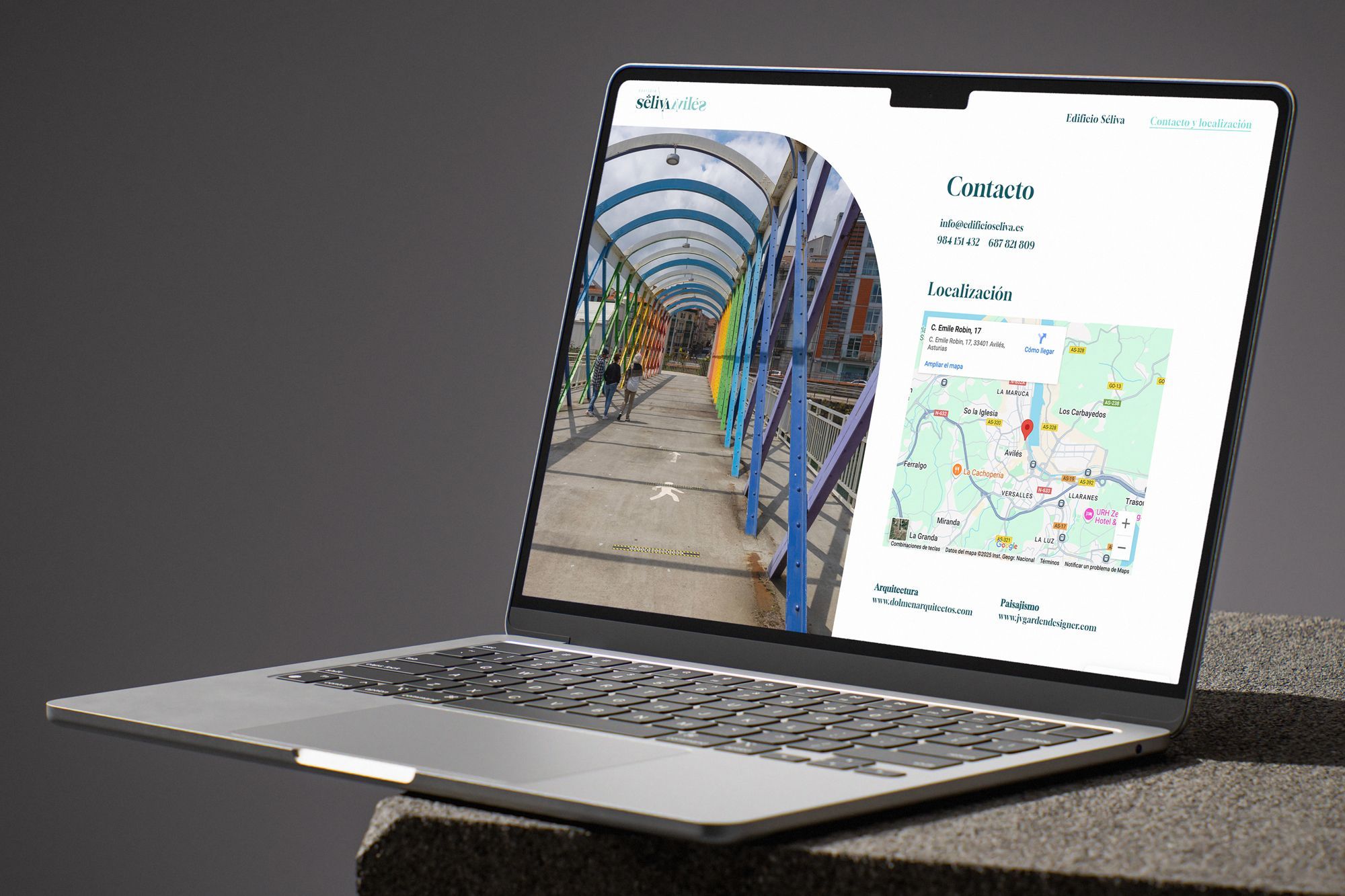
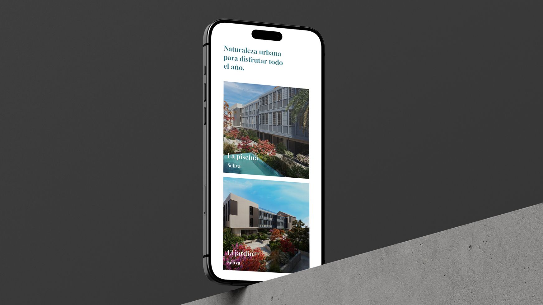
The website develops the corporate identity of the building and shows 3d infographics that show the final look and highlights of the new building.