
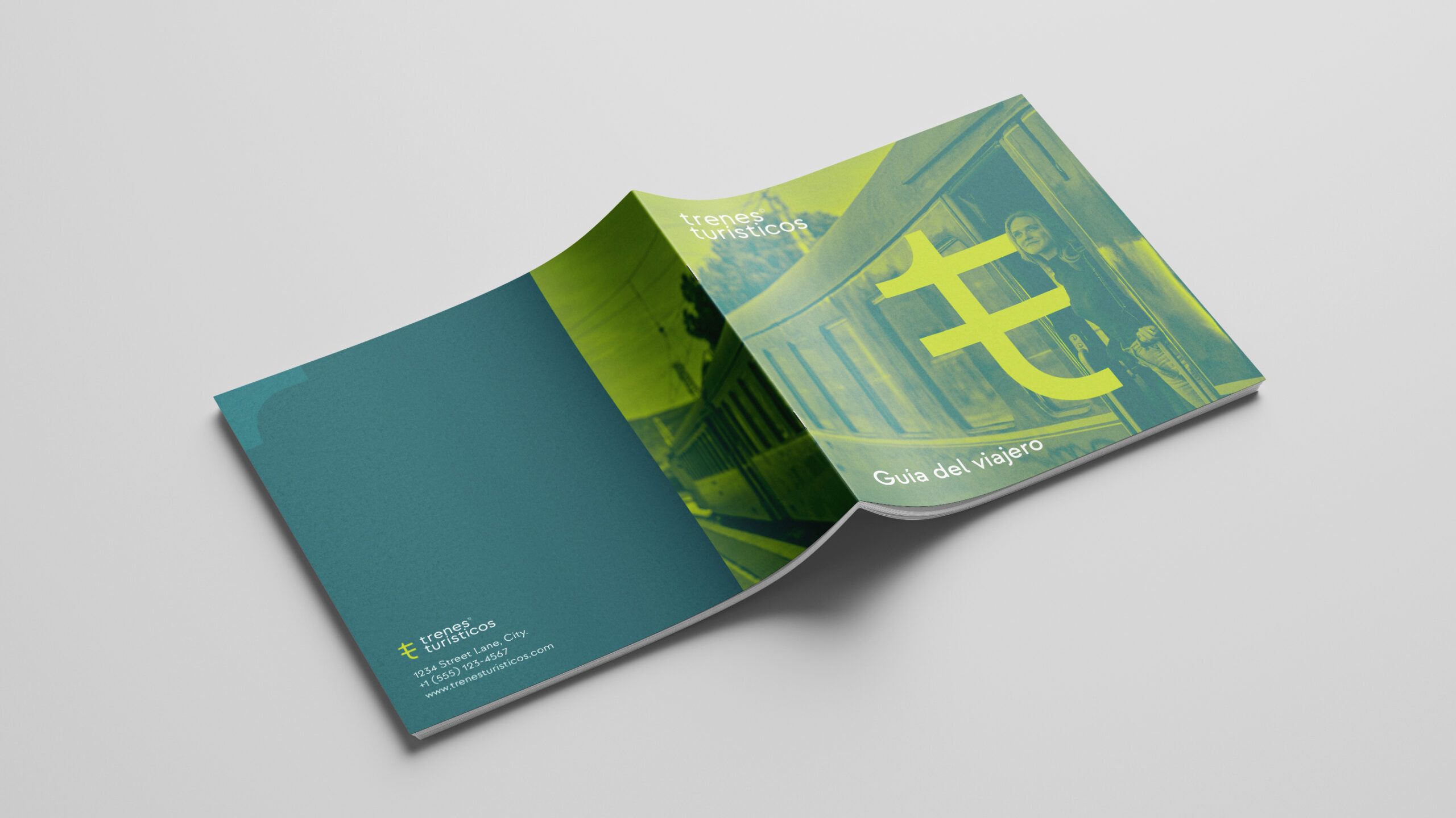



Trenes Turísticos is the umbrella organisation for all types of tourist trains nationwide and the various brands and products operated by Alsa. The brief was therefore to create a brand that would bring together all the tourist rail experiences operated by Alsa nationwide and give them their own distinct identity.
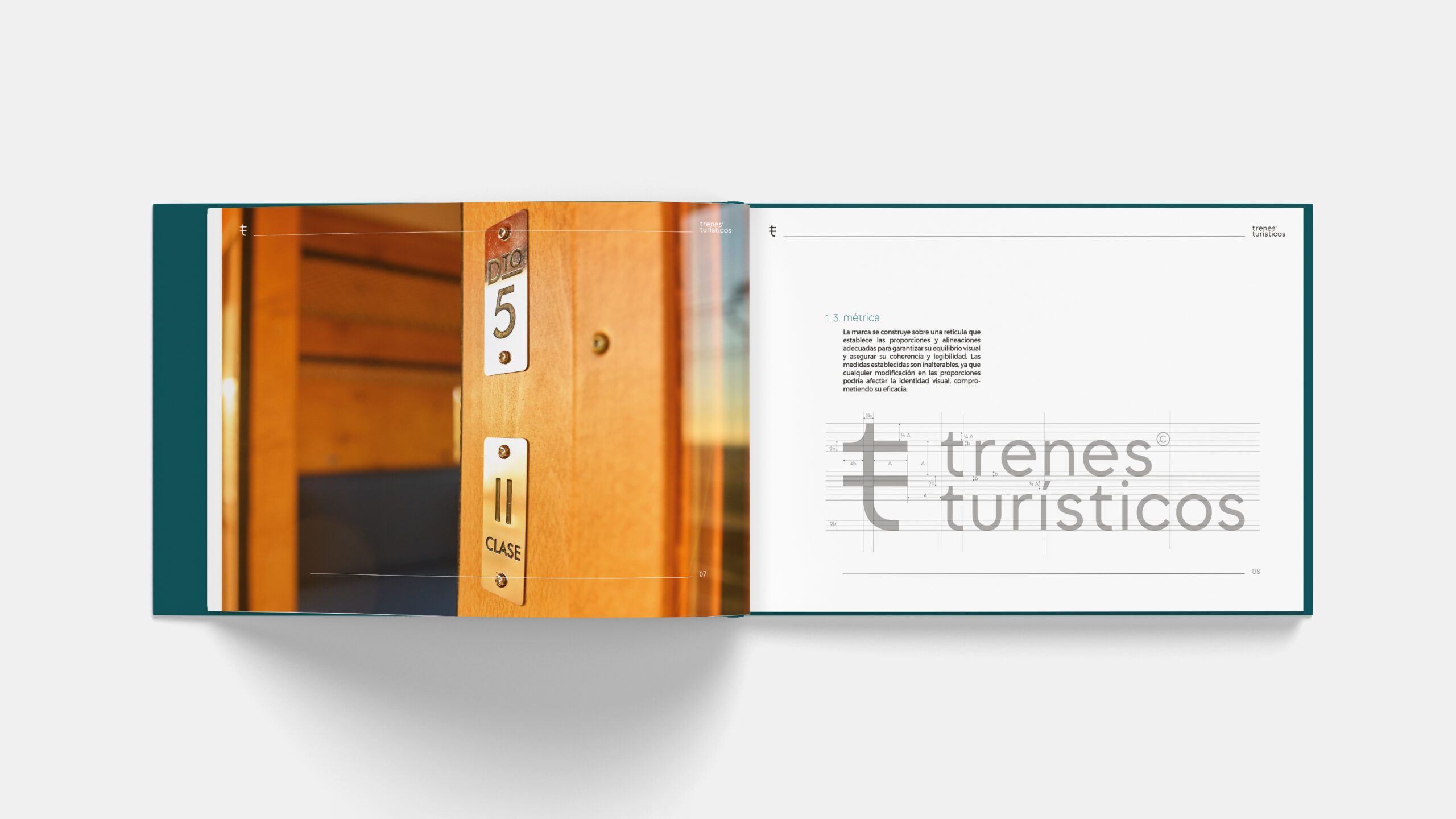
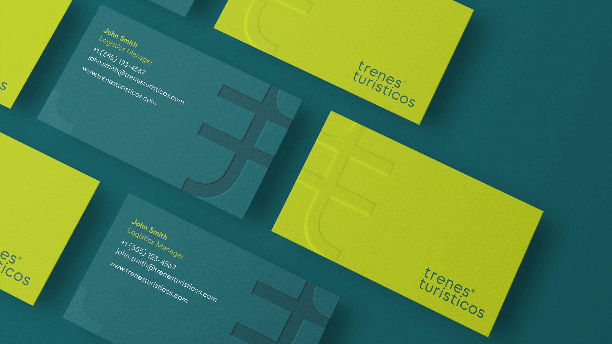
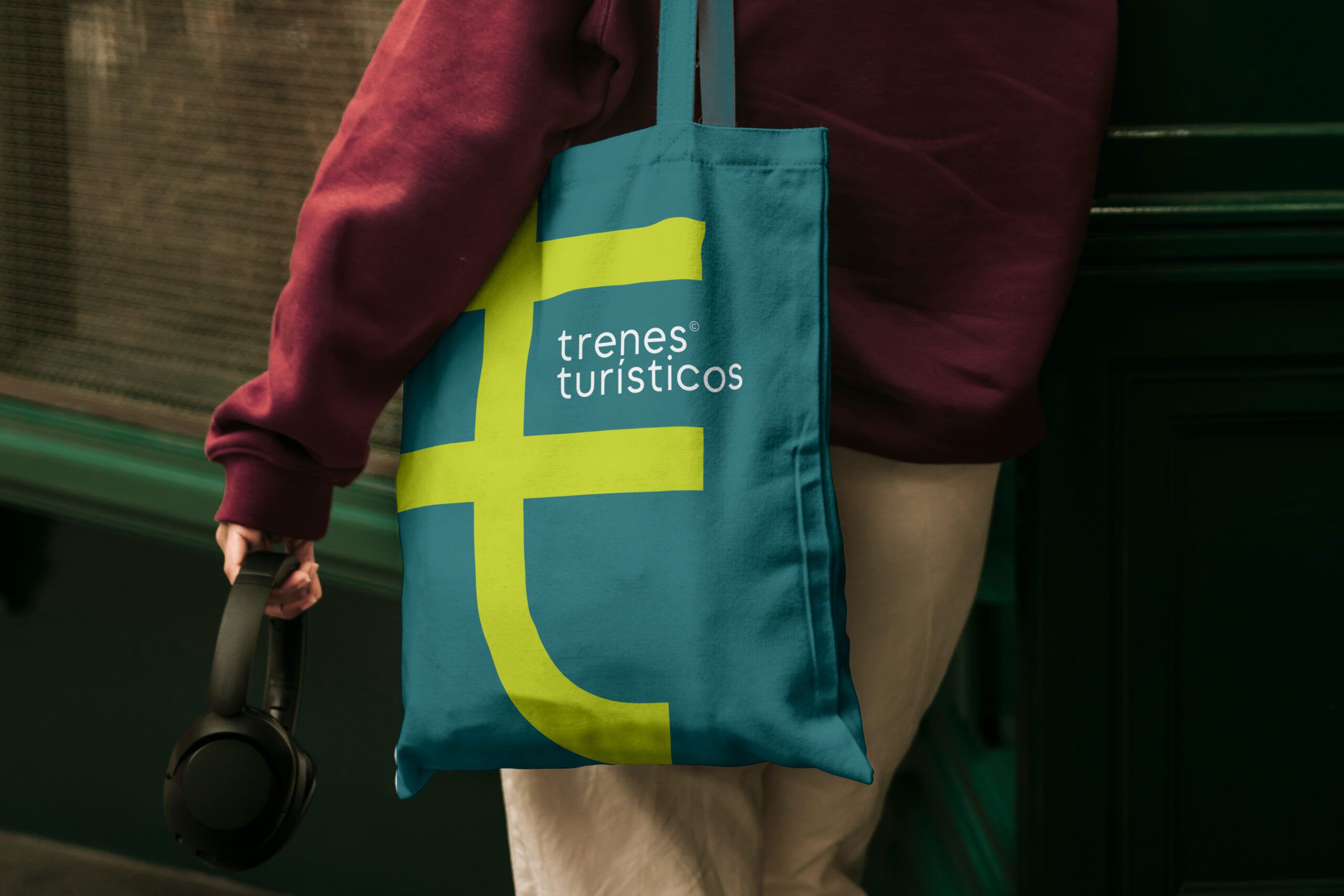
The design incorporates visual elements historically associated with trains, such as points, electrification pylons and signal posts. The graphic identity is based on a double ‘T’ transformed into a graphic symbol: a glyph that evokes catenary poles, level crossings and the very modular nature of the railway system. This form is accompanied by a contemporary typeface with nods to classicism, and a colour palette that combines elegance (English green) and vitality (lime green), emphasising the sustainable and experiential nature of the service.
A versatile, recognisable identity aligned with the values of slow travel, shared enjoyment and connection with the surroundings.
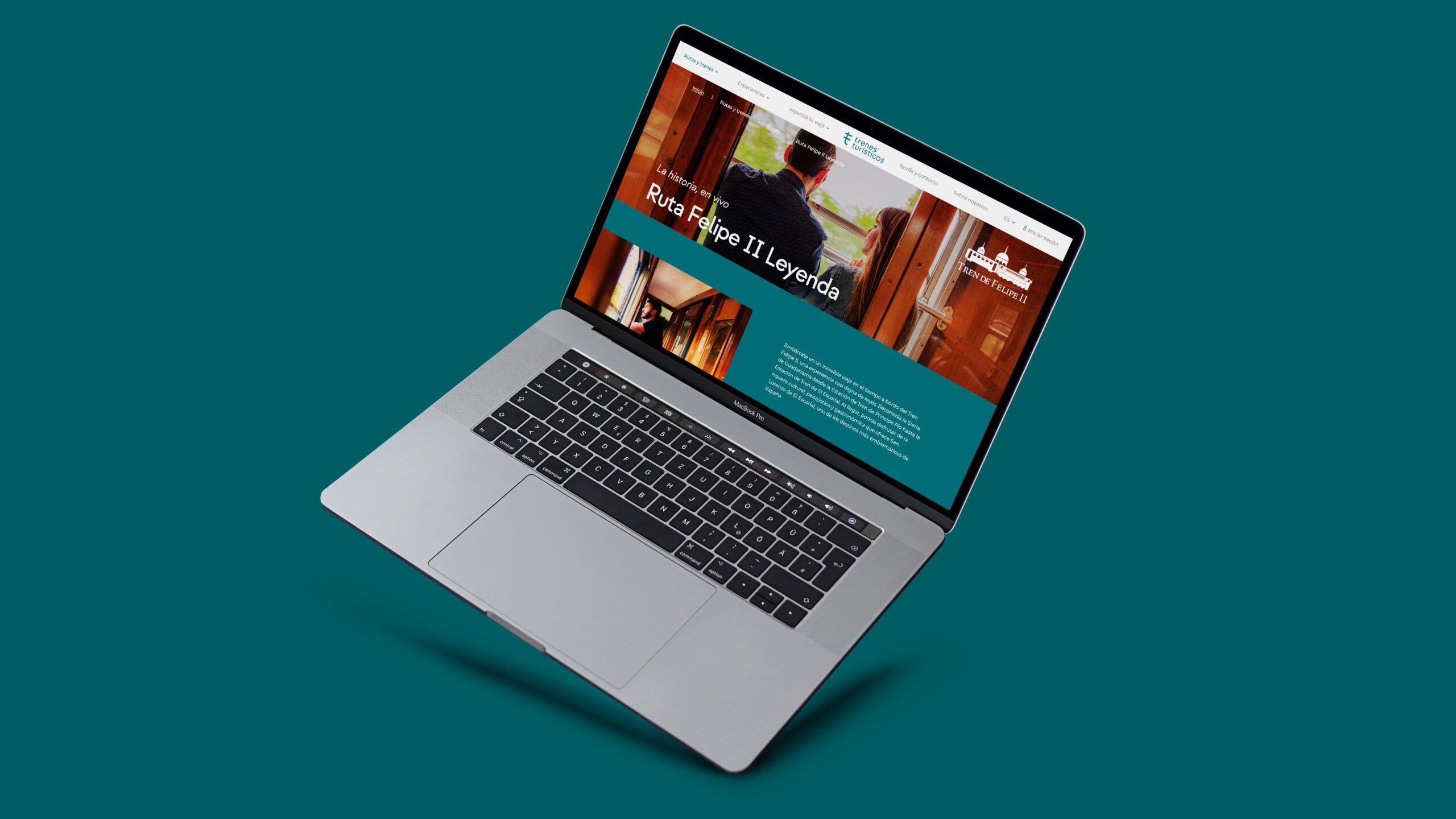
In addition to the brand development and its system of variations, the branding work includes the creation of a verbal, visual and photographic language, the design of custom pictograms, and applications on signage, installations and promotional materials.
We focus in particular on the brand’s adaptability to any medium or requirement and its ability to coexist with other brands.